| Author |
Message |
|
|
Post subject: Emma Watson Blend - What is missing?  Posted: Posted: April 11th, 2006, 6:00 am |
|
Joined: 27 September 2005
Posts: 2895
Location: Germany

|
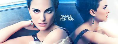
I've made this blend for a contest and something is missing - I don't know what... 

|
|
| Top |
|
 |
|
|
Post subject: Posted: April 11th, 2006, 8:54 am |
|
Joined: 05 January 2006
Posts: 4689
Location: Somewhere dark... *glowy red eyes*
|
|
I'm not too sure... Maybe a border?
_________________ <center>

[font=Times New Roman, serif].:Sig by me, open to requests of banners, anicons, avvies and wallies over PM:.
.:For Icon credit, PM me:.
[/font]
</center>
|
|
| Top |
|
|
|
|
Post subject: Posted: April 11th, 2006, 9:14 am |
|
Joined: 21 March 2006
Posts: 1137
Location: The Netherlands - Europe
|
|
A quote perhaps?
_________________ 
|
|
| Top |
|
|
|
|
Post subject: Posted: April 11th, 2006, 9:47 am |
|
Joined: 10 July 2005
Posts: 23149
Location: Where there are handsome heroes and sexy villains.. all that need some lovin' ;)
Country: ")
Gender: Female
|
|
Hmm..maybe some brushes. I don't mean to be rude but there is something really missing. Myabe between the main EW there should be some floral pattern, to the right of her. Just to kind of fill the gap?
_________________ 

^ By me and my SS *squiggle hugs*
|
|
| Top |
|
|
|
|
Post subject: Posted: April 11th, 2006, 4:41 pm |
|
Joined: 31 December 2005
Posts: 3506
Location: Hell.
|
|
uhhh... only half is loading for me! how annoying!
_________________
<center>
So come one come all to
This Tragic Affair
♥</center>
|
|
| Top |
|
|
|
|
Post subject: Posted: April 11th, 2006, 7:51 pm |
|
Joined: 04 June 2005
Posts: 2071
Location: Lothlorien
|
|
^ i am too!
_________________ <center>
www.silent-knight.net

Yo ho, haul together, hoist the colors high... Heave ho, thieves and beggars, never say we die
</center>
|
|
| Top |
|
|
|
|
Post subject: Posted: April 12th, 2006, 8:14 am |
|
Joined: 14 November 2005
Posts: 913
Location: USA
|
|
Hmmmm....maybe some text? A few brushes at the bottom perhaps?
_________________ 
|
|
| Top |
|
|
|
|
Post subject: Posted: April 13th, 2006, 5:52 am |
|
Joined: 30 January 2006
Posts: 3071
Location: Sweden
Country: ")
Gender: Female
|
|
| Top |
|
|
|
|
Post subject: Posted: April 14th, 2006, 11:46 am |
|
Joined: 30 January 2006
Posts: 139
Location: Mirkwood
|
|
It's missing some text. MAYDE some kind of suble border.
_________________
Smile. People will wonder what you've been up to.
|
|
| Top |
|
|
|
|
Post subject: Posted: April 14th, 2006, 4:07 pm |
|
Joined: 15 March 2006
Posts: 4107
Location: The Square! LOL!
|
|
Ohhhhh, I like it, I don't think it needs changing!
_________________ <center> 
 I saw you look away
Is what you've seen too much to take, or are you blind and seeing nothing?
(I saw you run) I saw you run away
Is what I've done too much to take or are you scared of being nothing?
|
|
| Top |
|
|
|
|
Post subject: Posted: April 17th, 2006, 1:34 am |
|
Joined: 03 June 2005
Posts: 1382
Location: Australia
|
Its lacking consistancy. If thats the right word, lol. I don't think it is. In fact, I'm sure it doesnt make sense. 
But what I mean is that the colours of the last two of the small sections don't really fit. I guess a texture over the top would fix that. 
Text and brushed could also be nice, but aren't essential. Don't over do them though, just a nice simple brush or sentence, in colours/fonts that match.
|
|
| Top |
|
|
|
|
Post subject: Posted: April 17th, 2006, 8:09 pm |
|
Joined: 04 June 2005
Posts: 1388
Location: California
|
I think you should add some text, vertically, in the middle of the larger Emma pic, and the strips of her face, on the grassy background part, basically. Maybe her name? _________________ 
Avatar by me 
|
|
| Top |
|
|
|
|
Post subject: Posted: April 17th, 2006, 11:46 pm |
|
Joined: 14 April 2006
Posts: 100
|
I would say a quote and brushes, either or. _________________ 

|
|
| Top |
|
|
|
|
Post subject: Posted: April 22nd, 2006, 10:31 pm |
|
Joined: 03 June 2005
Posts: 5928
|
Arien Elensar wrote: I think you should add some text, vertically, in the middle of the larger Emma pic, and the strips of her face, on the grassy background part, basically. Maybe her name? Precisely what I was going to recommend. It just needs a little something there to keep the blend consistent. Otherwise, amazing blend! I really like it!
|
|
| Top |
|
|
|
|
Post subject: Posted: April 23rd, 2006, 4:24 am |
|
Joined: 27 September 2005
Posts: 2895
Location: Germany
|
Thank you so much for your advise 
|
|
| Top |
|
|
|
|
Post subject: Posted: April 24th, 2006, 1:18 am |
|
Joined: 04 June 2005
Posts: 1388
Location: California
|
No problem! I'd love to see how it turns out. _________________
Avatar by me
|
|
| Top |
|
|
Who is online |
Users browsing this forum: No registered users and 5 guests |
|
You cannot post new topics in this forum
You cannot reply to topics in this forum
You cannot edit your posts in this forum
You cannot delete your posts in this forum
You cannot post attachments in this forum
|
Powered by phpBB © 2000, 2002, 2005, 2007 phpBB Group
Boyz theme by Zarron Media 2003
|
|