 
|
Page 1 of 1
|
[ 3 posts ] |
|
| Author |
Message |
|
|
Post subject: Ammy's Semi-Regular Tutorial Thread  Posted: Posted: January 20th, 2010, 3:22 pm |
|
Joined: 07 September 2005
Posts: 2685

|
Lothy will probably be the only one using these, but I figured it might do me some good to practice writing tutorials. Thus, a tutorial thread. =D
I'll be posting as often as I make these, which will sometimes be very often and sometimes not so much. If you have a specific graphic that you'd like a tutorial for, please let me know! It will take priority over the random ones I do. Sorry guys, only Photoshop tutorials for right now. I have Photoshop CS2, but nearly everything I do can be substituted in an earlier version.
Here we go.
[font=georgia]Banner Tutorial - Lighten Effect[/font]
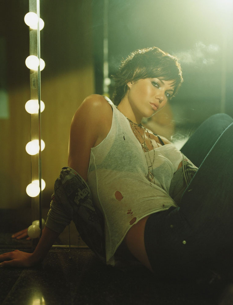
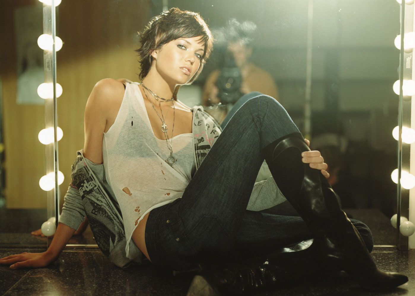
Today we'll be making this:

YOU NEED TO KNOW ABOUT:
--Curves
--Hue/Saturation
--Brightness/Contrast
--ColorFill layers
--Lighten/darken effects
To start off, we need a couple(2) decent quality pictures with relatively dark backgrounds. It can have a light background, too, but darker is better.
I’ll be using:
http://sweetandtalented.com/images/moore/moore59.jpg
-and-
http://sweetandtalented.com/images/moore/moore58.jpg
Now, these pictures are very similar, so we’ll have to make one of them smaller than the other to add some contrast.
STEP 1:
Blend your pictures onto your canvas. 500x200 is my favorite to work with, but I guess it doesn’t matter how big or small it is. (Tip: Use a vector mask instead of just straight-up erasing when you blend, it makes going back and undoing something much easier)

The coloring on the pictures is a little bit off, so there are two ways you can fix this.
STEP1.1(optional):
Curves -
Open up a new curves layer.
RBG: point 1 - 73, 119
Green: point 1 - 137, 121

This really depends on your pictures. The key is to mess with it until it works.
STEP1.2(optional):
This is for if you don’t like curves. It’s a little bit trickier, but it works about the same.
Duplicate the layer you’ll be adjusting.
Go to Image>Adjustments>Variations
Move the lever all the way over to ‘fine’. (Click the image labeled ‘original’ in case you’ve used variations previously.)
More Red: 2 Clicks
More Magenta: 1 Click
More Blue: 2 Clicks
Lighter: 5-6 Clicks

Again, this varies between pictures. Pay attention to the colors that you want less of and click the colors opposite them to even it out.
Now that our pictures are a bit more similar, we move onto the next steps.
STEP 2:
Clean it up. Don’t merge the layers yet, sharpen both layers by going to Filter>Sharpen>Sharpen.
Smooth the skin out with the blur tool, use a small round brush with soft edges at 45% transparency.(Tip: Do not blur over the nostrils, eyebrows, eyes, lips, or hair.)
Take your sharpen tool, set it to 50% transparency and move it over the eyes and lips once.

STEP 3:
Now comes the fun part.
Make a new Curves layer.
RGB: Point 1 - 97,58
Point 2 - 171,165
Blue: Point 1 - 88,74
Point 2 - 141,152

STEP 5:
Duplicate both of your original pictures(with all the touch-ups), move them to the sides a little bit.
Desaturate them (ctrl+shift+U), move the layers to the top of the stack so they’re not effected by your curves layers. Set both layers to Lighten.
Erase the parts that overlap or look funky. (REMEMBER: Use vector masks for erasing!)

STEP 6(optional):
Repeat Step 5 with the smaller picture again, move the new layer to a different spot on the canvas.

STEP 7:
Create a Hue/Saturation layer.
Saturation: +7

STEP 8:
Create a Brightness/Contrast layer.
Brightness: -51
Contrast: +18

STEP 9:
Create a Color Fill layer with #012841 or dark turquoise, set it to Lighten.

STEP 10:
Adding text & Extras.
Go back before Step 8, make a new layer. I had a starry brush for this one, but anything with a nice texture will be fine. Make sure that the brush is white(#FFFFFF) and go over your canvas a few times, mostly around where you’ll be putting your text.
For the dotted brush, I set the layer to 40% opacity and went into the blending options, added a drop shadow with 90% opacity, 1px distance, and 0px size.

The fonts I used are 0514oem at 8pt (80% height, 300px spacing) and Bickham Script Pro at 36pt. I set both of the blending options to drop shadow 100% opacity, 1px distance, and 0px size.
And we’re finished!
---------------------------
Last edited by Ammy Dawne on January 21st, 2010, 2:22 am, edited 1 time in total.
|
|
| Top |
|
 |
|
|
Post subject: Posted: January 21st, 2010, 1:20 am |
|
Joined: 04 February 2006
Posts: 9445
Location: Southeast of the Northern part of West Hyglemr
Country: ")
Gender: Female
|
|
Oh, helpfulness! I don't usually think of vector masks for erasing, so that's a good one. And I usually just merge and go too, so this is good for me.
_________________ going on a journey through my old claims
|
|
| Top |
|
|
|
|
Post subject: Posted: January 21st, 2010, 2:27 am |
|
Joined: 07 September 2005
Posts: 2685
|
|
Glad it helped! if anyone uses the tutorials, I'd love to see what you've made. =)
|
|
| Top |
|
|
|
|
Page 1 of 1
|
[ 3 posts ] |
|
Who is online |
Users browsing this forum: No registered users and 3 guests |
|
You cannot post new topics in this forum
You cannot reply to topics in this forum
You cannot edit your posts in this forum
You cannot delete your posts in this forum
You cannot post attachments in this forum
|
Powered by phpBB © 2000, 2002, 2005, 2007 phpBB Group
Boyz theme by Zarron Media 2003
|
|


