Arwen-Undomiel.com
http://arwen-undomiel.com/forum/

Do You Remember the Shire- Blending Tutorial
http://arwen-undomiel.com/forum/viewtopic.php?f=37&t=21599
Page 1 of 1

Author:  lembas [ July 22nd, 2011, 3:09 pm ]
Post subject:  Do You Remember the Shire- Blending Tutorial

I was feeling in the mood to make another tutorial, and Morgana suggested that I do one for this banner.

This banner took an awful lot of work in merely getting the blend right, so my Tutorial will be in 2 parts- one for the blend, and one for the colouring

Apologies, if the first few stages look slightly different to the end result- i stupidly flattened my blend and saved it, which meant I had to remake it- and thus some images may be slightly bigger/smaller than in my finished banner :D

I work in Photoshop CS2, but this should be translatable for other versions:

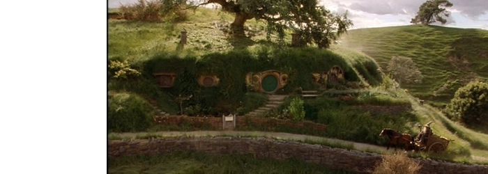
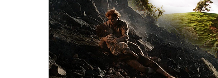
This Is what we're aiming for :D
Image

1-
Open a new canvas in photoshop- mine will be 700x250

2-
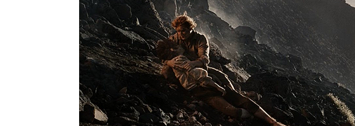
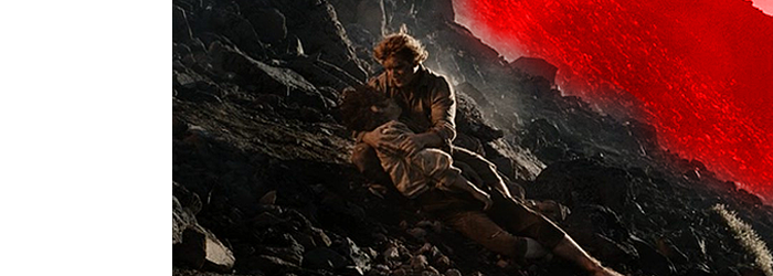
Then I grabbed my images- for this banner I used This screencap of Sam & Frodo, This Screencap of Sam and this image of Gandalf arriving at Bag End

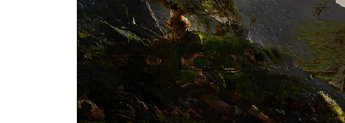
First I pasted the Image of the shire onto my canvas. Then I flipped it, resized it and sharpened it.

Image

As I wanted the shire to look dreamy and idylic I want to intensify the colours, so to do this I duplicated my image twice (Ctrl+J). The first (bottom most) layer copy I set the blend mode to Screen 100% and the 2nd (top copy ) I set to Overlay 100% which gives my image a more vibrant look. Then I merge all three layers.

Image

3-
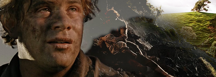
I then grabbed the Sam & Frodo pic, and pasted it on a new layer on my canvas- above the shire one. Then I re-sized it, sharpened it and flipped it horizontally, and tried to place it so that S&F sat in the middle of my canvas and that the lighter gray area sat above my image of the Shire

Image

I then changed the blend mode of the S&F image to Darken 100%- yes it looks awful, but we'll tidy it up in a minute

Image

4-
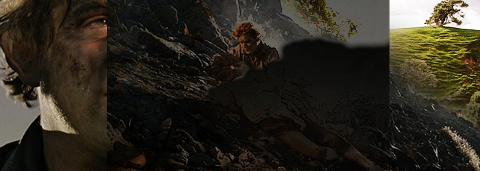
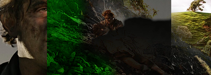
Now comes the tricky part- Blending. First I took my eraser tool Hardness= 0 size= 150 and removed the light grey cliffs of Mordor.

I've marked the area in red to show you what I erased, whilst the 2nd pic is what it *should* look like

Image
Image

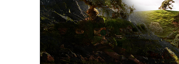
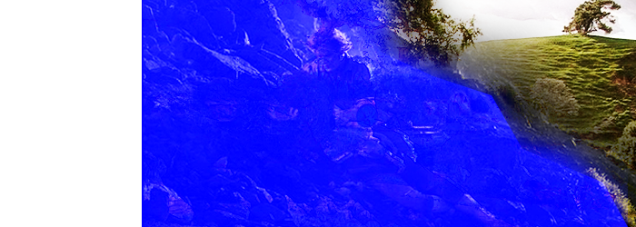
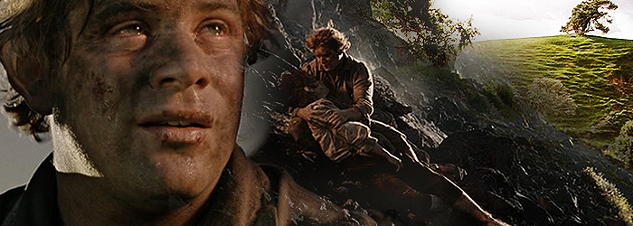
Now, on the image of the shire, -using the eraser, again I take out anything that is underneath S&F. This should cleans up the image and makes a nice blend- where it looks like Mordor fades into the shire.

Again I've marked out the area I erased- this time in blue!

Image
Image

Then I merged all the layers. From now on I will call these my "Base"

5-
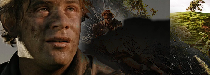
And now it's time for our subject- Sam!

I pasted him onto the canvas above the Base- resized and sharpened. Then I set the blend mode to Darken 100%.. pretty ugly huh?

Image

Then on the base I erased any parts that covered Sam's Face or Hair. The green is roughly what I erased

Image
Image

6-
Now I can see all of Sam's Face I changed the Blend mode of the image to Lighten 100% which means that the dark areas of the Sam image fade into the Base one- Laziest way of blending ever!

Image

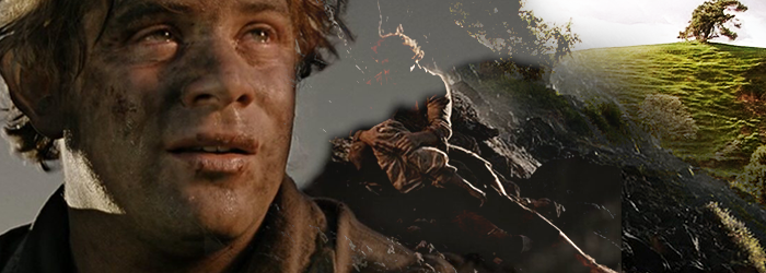
Then I use the eraser again and remove the edge of the Sam image that overlaps the base so it merges into the base.

Image

Now I need to deal with the light greay area at the top. To do this I took the Burn Tool Size=200, Range= Midtones, Exposure -30% and used it to darken all the pale grey. As the light grey is darkened, the base image should should become clearer and blend into the image of Sam

Image

Nearly Done!

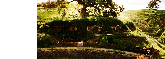
7- To finish the Blend- I merged all of my layers together and sharpened them. Then in order to increase the contrast of my image, I duplicated the Blend and set the top layer's blend mode to Screen 100%.

The Final Blend should look something like this:

Image

I hope that was useful to someone

coming soon....

Part 2...
Image

Author:  Cara [ July 23rd, 2011, 1:49 am ]
Post subject:  Re: Do You Remember the Shire- Blending Tutorial

That was awesome, Lembas! So different way I am doing my images :lol: Will try it later ^^

Can't wait for coloring.

Author:  [ July 27th, 2011, 2:24 pm ]
Post subject:  Re: Do You Remember the Shire- Blending Tutorial

Ooh, that was interesting. Even though I don't make banners it was great to see how they are made step by step. It gave me a great insight into it. Thanks. :)

Author:  lembas [ August 2nd, 2011, 6:21 am ]
Post subject:  Re: Do You Remember the Shire- Blending Tutorial

Morgie: Heheh thanks Part 2 is on it's way when photobucket co operates I use several different ways of blending, but using darken/lighten blend modes I find is frequently helpful- and it took me forever to get the blend right on that banner :D

Ea: Glad I could be insightful, I was worried it was a bit too complicated to understand :D

Author:  Ariadne394 [ June 18th, 2012, 10:37 am ]
Post subject:  Re: Do You Remember the Shire- Blending Tutorial

I found your blending tutorial very helpful, Lembas. For the most part, I've been using one method of blending in my graphics, so I'm glad I now have a few more tricks up my sleeve. :)

Author:  Aredhel Ar-Feiniel [ June 18th, 2012, 12:23 pm ]
Post subject:  Re: Do You Remember the Shire- Blending Tutorial

Awesome tutorial! I do it totally differently from you, but my work is extremely sloppy if you dissect the layers in my work and examine them... thanks for the tips! :p

Author:  Erin Lunaire [ April 26th, 2014, 3:57 pm ]
Post subject:  Re: Do You Remember the Shire- Blending Tutorial

This tutorial is really great. I used part of it, to make this banner. (The thing you did to the shire part, to make it more vibrant.)

Image
(Damn, I just realised his collar really blends in with the background... oh well. I know better next time.)

I am extremely curious, about how you applied the textures and stuff. But this really helped me improve, because I never could get saturation to look good. It would make my graphics look horrible. Now I don't have to do that, I can apply this. :)

(It was also based off the style you used for the banner you made me, because I really wanted to try making that style myself.)

Author:  lembas [ April 26th, 2014, 6:00 pm ]
Post subject:  Re: Do You Remember the Shire- Blending Tutorial

Oh my gosh that looks incredible Erin, the blend is smoother and neater than the one in the tutorial and I never noticed the thing about his collar, because the autumnal colours are so pretty!!

I'm starting to worry that I shouldn't have shared my secrets! Lol :) because you've done an amazing job!

Still If you are interested in how I did colouring and textures on the Sam banner, part 2 is here and I have an ooooold colouring tutorial here. I work slightly differently now as I tend to use the colour balance function too, but the method is pretty much the same.

Can't wait to see more, so I can cry over how much better than me you will be! :P

Author:  Erin Lunaire [ April 26th, 2014, 6:14 pm ]
Post subject:  Re: Do You Remember the Shire- Blending Tutorial

:blush: :hug:
I might cry. (Happy tears.) That is the nicest thing anyone has ever said to me, to do with my graphics.

I will check that link out, thanks. I use Paint Shop Pro 7, but it's not that much different from photoshop with some parts of it. I am interested in learning how to apply textures properly, because that was something that I could never quite figure out.

Author:  lembas [ April 26th, 2014, 6:34 pm ]
Post subject:  Re: Do You Remember the Shire- Blending Tutorial

Awww that's so sweet:hug:

Paintshop pro sadly doesn't have selective colour, but there are loads of great colouring tutorials for psp users out here, it's been over 5 years since I last used psp! But Photoshop is now [url=http://www.arwen-undomiel.com/forum/viewtopic.php?f=37&t=22867]free for all[ /url], if you fancy a change! (I seem to have made this topic the link to my other posts thread! )

I'm not the biggest fan of textures there's probably only about 3 that I frequently use, which are the scratch one in the banner above, a parchment texture, and a plasma nebula stock from google. I find that more often than not, they obscure the subject rather than enhance the way it looks, but that's my personal taste.

The sort of things usually described as textures, like the ones on AU, are a bit dated now, and I find that you get a better effect with a stock image or bokeh. But any image can be made into a texture, you could blur a random screencap or use a section of anther pic, if it's big enough :)

Page 1 of 1 All times are UTC - 5 hours [ DST ]
Powered by phpBB © 2000, 2002, 2005, 2007 phpBB Group
http://www.phpbb.com/