| Author |
Message |
|
|
Post subject:  Posted: Posted: December 5th, 2005, 9:09 pm |
|
Joined: 29 November 2005
Posts: 149

|
|
I am having trouble seeing how you blended your images without the edges looking faded like on mine...also whats this business about the noise tool and shading....I wanna know how to add text and shade ir or fade it like so its not standing out but its there....Thanks this is great, i'm loving going through art school...lol
<cheers>
p.s. thanks for the compliment on my sig
_________________ 
|
|
| Top |
|
 |
|
|
Post subject: Posted: December 5th, 2005, 9:56 pm |
|
Joined: 13 August 2005
Posts: 2567
Location: Michigan
|
DaBoss wrote: I am having trouble seeing how you blended your images without the edges looking faded like on mine I think the background color you use helps with how well it blends. Sometimes you might have to adjust the background so that it looks good with the pictures that you're using. I usually blend little sections of the picture at a time, not just a whole side. You also don't have to clip everything out around the image. With this one I recently did, the picture actually goes out as far as the middle of the letter 'D'. I just faded it into the the background.  It takes alot of practice to work out blending. It's not as easy as it looks. Believe me, yours looks alot better than my first attempts.  DaBoss wrote: ...also whats this business about the noise tool and shading.... Actually I'm not sure myself. I'm still learning too. DaBoss wrote: I wanna know how to add text and shade ir or fade it like so its not standing out but its there....
Fading is really easy. On the Layers Palette, there are two boxes. The right one has a little button with an eye and on the right of that is a little slider thing. The slider should be on 100%, but if you move it to the left it makes an image become transparent. This works with pictures and text both. I used the transparent thing with the word Decide in the example I have above and I think it gave it a nice look. _________________ <center>


</center>
|
|
| Top |
|
|
|
|
Post subject: Posted: December 5th, 2005, 10:08 pm |
|
Joined: 29 November 2005
Posts: 149
|
Thanks for telling me my banner looked good, Its all thanks to you 
Also thanks for tip on text, and im still kinda lost when it comes to what you mean about the blending....can you possibly show me how to creat my own gradiants? Also maybe take me through another banner??? If you have time...Thanks you have been more help can I could have ever hoped 
|
|
| Top |
|
|
|
|
Post subject: Posted: December 5th, 2005, 10:12 pm |
|
Joined: 13 August 2005
Posts: 2567
Location: Michigan
|
DaBoss wrote: Also maybe take me through another banner??? If you have time...
Well, I'll be working on banner for a contest this evening, so I'll make a tutorial with it,- that way I can get some pics of what it should look like at various stages in the blending process. I can probably have it up sometimes tomorrow. _________________ <center>
</center>
|
|
| Top |
|
|
|
|
Post subject: Posted: December 5th, 2005, 10:49 pm |
|
Joined: 29 November 2005
Posts: 149
|
|
Thank You Shieldmaiden....much appreciation
_________________
|
|
| Top |
|
|
|
|
Post subject: Posted: December 6th, 2005, 7:09 pm |
|
Joined: 13 August 2005
Posts: 2567
Location: Michigan
|
Here’s the tutorial I promised. I'm including some of the materials I used in case you'd like to copy what I did as practice:
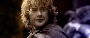
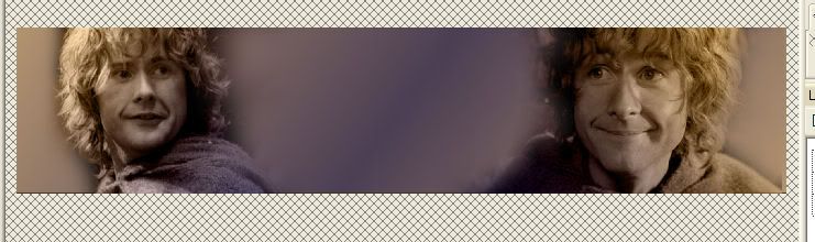
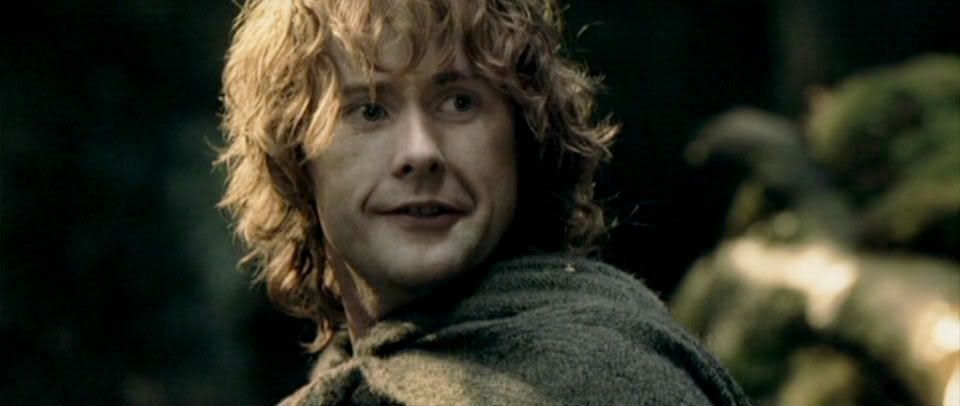
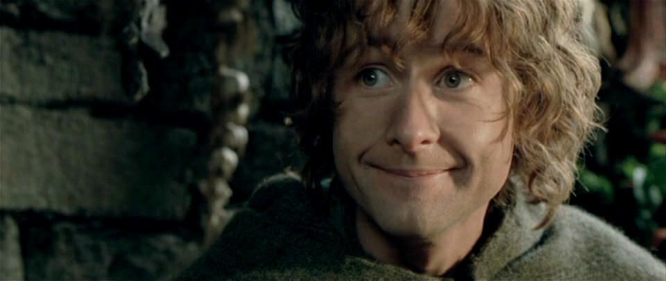
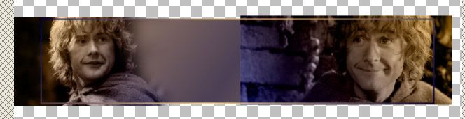
First I found the pictures I was going to use. My subject is Pippin so I’ll be using these two:
http://i10.photobucket.com/albums/a111/ ... 3a0294.jpg
http://i10.photobucket.com/albums/a111/ ... 669632.jpg
I tried a lot of gradient with the two pictures and finally found one I liked. This is how I got it. Click the Fill tool and then the top box in your Materials palette. Go to Gradient>Edit. You should get a box that looks like this:
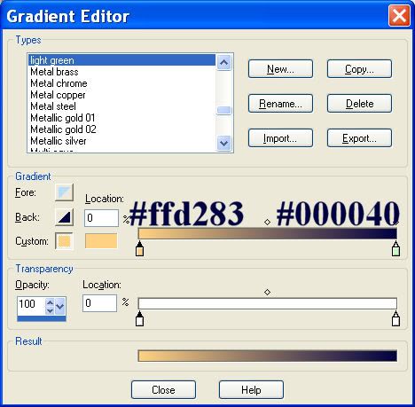
Click New and type a name for your new gradient (mine will be orange/blue) Now click on that first sliding thing in the box below (the one under #ffd283). Click on the second box next to Custom. It will bring up a Color box. Type #ffd283 in the HTML box and click okay. Now go on the second slider thing and type #000040 for that color. Your area should now look exactly like the one in my example above. Click Close and then okay to the save question that pops up.
You should notice in the preview box that you can turn the angle for the direction the gradient goes. I did different angles for each of my pictures so that it looked how I wanted. Like I showed you before, fill each of the pictures with the gradient. This is how it looked for me:

Now I filled the 700x150 with my color- at 100% opacity, I had it (under Gradient) at a 306 angle, Repeats: 1, Invert: unchecked. Then I filled it again on a new rastor layer (normal) - at 30& opacity, Angle: 306, Repeats 1, Invert: checked. That gave me this background:

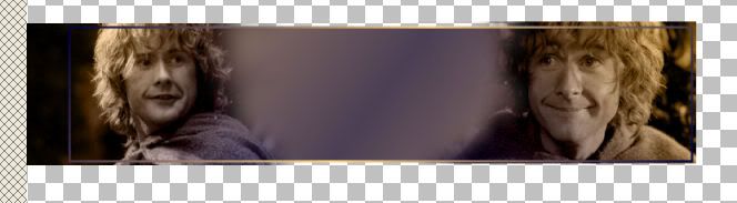
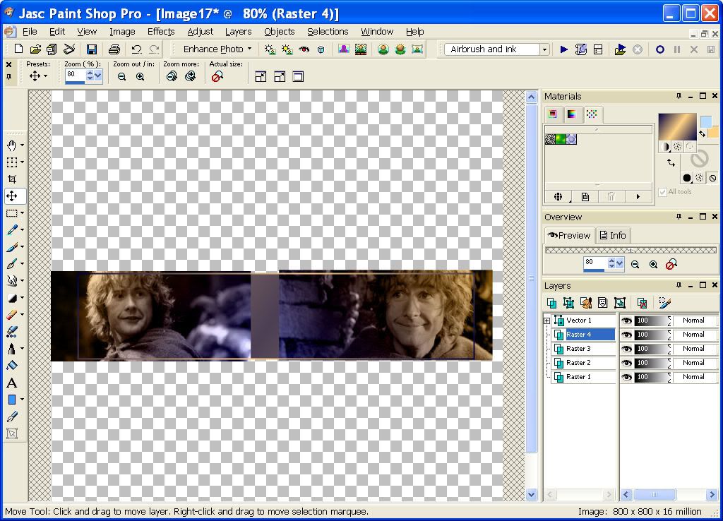
Now I copy Merged the background and paste it into the 1000x1000 workspace. Do the same with the two Pippin pictures. This is how I organized it:
http://i10.photobucket.com/albums/a111/ ... 1f030a.jpg
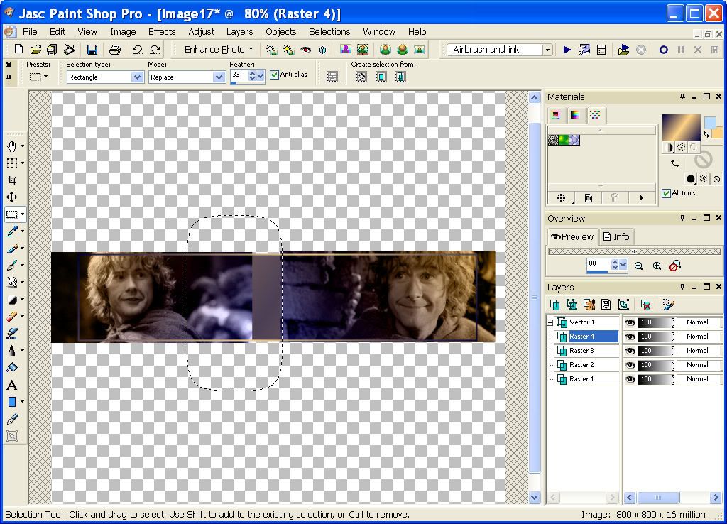
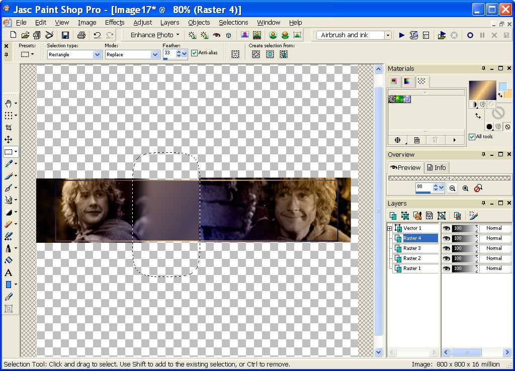
Now I’m going to blend the picture of Pippin of the right. First I select with my Move tool, then I select the area I want to blend (making sure Feather is at 33.):
http://i10.photobucket.com/albums/a111/ ... 58de0e.jpg
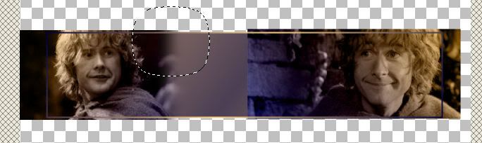
Now I click delete. And away it goes! :
http://i10.photobucket.com/albums/a111/ ... c5bad6.jpg
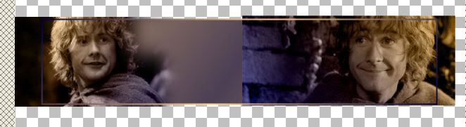
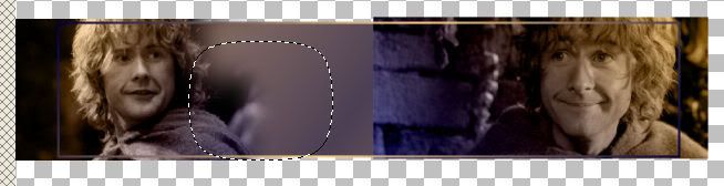
Now that the big chunk is gone, I’m going to delete in small pieces (i've cropped away the rest of the screen so you can just see what I'm deleting:
http://i10.photobucket.com/albums/a111/ ... b55c81.jpg
http://i10.photobucket.com/albums/a111/ ... a58741.jpg
http://i10.photobucket.com/albums/a111/ ... 3bab5a.jpg
http://i10.photobucket.com/albums/a111/ ... 1ecebc.jpg
Now that side of Pippin has been blended into the background image with a couple delete clicks. Now I do the exact same thing with the rest of the sides of the Pippin picture:
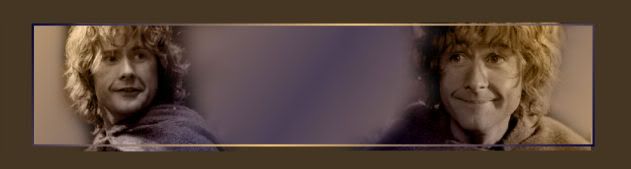
Now I'll crop everything away that will not be in my final version:
Text is the final part. I did 'Pippin' in the font Hobbiton, and 'A hobbit of some intelligence' in the font Selfish. Selfish is a hard font to find, but Porcelain is a good substitute. The fill for the text was a light purple, and then outline was a darker blue. I faded 'Pippin' until I liked how transparent it was, so that the other words stood out more:
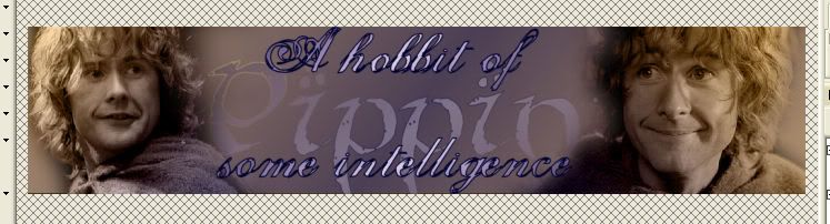
I darkened the edges like I described before, and that was it!:
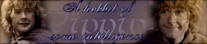
Any questions about what I did up there? Everyone has a different style for making banners, so you'll probably make banners differently from the way I do. But this is how I do it for now. _________________ <center>
</center>
|
|
| Top |
|
|
|
|
Post subject: Posted: December 6th, 2005, 9:47 pm |
|
Joined: 29 November 2005
Posts: 149
|
wow thanks...mine turned out great...of course by following your lead but hey I am starting to understand somethings better....
I do have a few questions...I was unable to make the gradient like you...said there was an error...did you have to find new colors and add them?? or is it just me? Also how do you get the box around the banner to see where you have to crop...like in this image
http://i10.photobucket.com/albums/a111/ ... 1ecebc.jpg
Next I was wondering if you knew how to put like a flash animation into the banner or make a banner a flash image?? If you don't wanna go into it I would love it if you kept going over things with me....maybe something new that we have not learned....i am not sure what that is seeing how I am really new....
Thanks so much you have been sooooooo great _________________
|
|
| Top |
|
|
|
|
Post subject: Posted: December 6th, 2005, 11:13 pm |
|
Joined: 04 June 2005
Posts: 2150
Location: Behind you with a squirtgun
|
|
Hmm, that's an interesting way to make banners, I love reading people's tutorial's I learn so much from them! I use PSP 9 too, and I have to say DaBoss your banners are very very good for your first one, mine didn't look half as good!
Shieldmaiden I think it's very nice of you to help you, good luck on your banners!
I'm not quite sure, but Animation usually requires Animation Shop 3.
_________________ <center> Proud Member many Clubs (specially the Nazgul Club) Nazgul #3
 </center>
|
|
| Top |
|
|
|
|
Post subject: Posted: December 7th, 2005, 12:21 am |
|
Joined: 29 November 2005
Posts: 149
|
|
Thanks for the compliment on my first banner Tanthoronial....I like it also and think Shieldmaiden is doing a great job of helping me.
Yes I have Animation shop 3 but I just was asking her to run through how to make animation or flash banners....thats something I have no idea about..not even close...lol
_________________
|
|
| Top |
|
|
|
|
Post subject: Posted: December 7th, 2005, 12:33 am |
|
Joined: 04 June 2005
Posts: 2150
Location: Behind you with a squirtgun
|
|
I wish I could help you, but my Animation Shop 3 hates me... its unfortunate, but what can you do?
And no problem about your banner! If you want a different way to make a banner, I have a tutorial on my site, though I have to say, it may be more complicated and Shieldmaiden's way is something I plan to try myself when I have time...
_________________ <center> Proud Member many Clubs (specially the Nazgul Club) Nazgul #3
</center>
|
|
| Top |
|
|
|
|
Post subject: Posted: December 7th, 2005, 8:11 pm |
|
Joined: 13 August 2005
Posts: 2567
Location: Michigan
|
|
I do have a few questions...I was unable to make the gradient like you...said there was an error...did you have to find new colors and add them?? or is it just me?
I've never had that problem so I don't know why it would do that.
Also how do you get the box around the banner to see where you have to crop...
I made a rectangle with the Rectangle Tool by in the materials paletter making it a colored outline and a transparent inside. Then I just clicked one corner of the 700x150 area in the graphic and create the size I wanted. You just have to make sure that the shape stays at the top of the layers for it to work right.
yeah, actually I've pretty much taught you everything I know myself. Kinda sad how little I truly know.
And what exactly do you mean by flash banners? Do you mean animations like my Narnia glitter name? Sorry, I think I'm a little brain-dead today, cause I probably should understand what you meant by that...
_________________ <center>
</center>
|
|
| Top |
|
|
|
|
Post subject: Posted: December 7th, 2005, 11:22 pm |
|
Joined: 29 November 2005
Posts: 149
|
|
yeah i guess i did mean animated...but i mean like lets say a banner like yours but with amination also...so both non animated and animated all in one. Hope you understand what i mean...ok another example...moving background and stand still foreground...lol...sorry maybe not....but if you understand and you know how....yay me
_________________
|
|
| Top |
|
|
|
|
Post subject: Posted: December 7th, 2005, 11:27 pm |
|
Joined: 29 November 2005
Posts: 149
|
|
Ok i also have another few questions....1. How do i make a certain image stand out??? I tried a few things but does not work...2. I cannot get that boarder to work...how was it you did that again...and if you could be a little more specific i kinda need that. 3. I can still not blend like your banners you have..how do you make it blend without fading the image a little??
Thanks a bunch
<cheers>
_________________
|
|
| Top |
|
|
|
|
Post subject: Posted: December 8th, 2005, 11:25 pm |
|
Joined: 04 June 2005
Posts: 2150
Location: Behind you with a squirtgun
|
Making an image stand out, I can help with that one I think.
You really can do it anyway you want, try maybe using some of the blur's on the background of the image, so that your one picture will stand out, or one of my favorite effects, Soften Focus, its works really nicely and it softens the whole banner. Of if you generally just go into your effects and do something to the background but not the picture you want to stand out.
Oh, lightening and darkening it, using like a brush might make it stand out too... I don't know if any of that made sense...  _________________ <center> Proud Member many Clubs (specially the Nazgul Club) Nazgul #3
</center>
|
|
| Top |
|
|
|
|
Post subject: Posted: December 9th, 2005, 1:48 am |
|
Joined: 29 November 2005
Posts: 149
|
|
Thanks for trying to help me...however no it did not make sense...I never used any of them affects...possibly if you could walk me through using them or send me to a tutorial on them affects...Thanks
_________________
|
|
| Top |
|
|
|
|
Post subject: Posted: December 10th, 2005, 1:59 pm |
|
Joined: 04 June 2005
Posts: 2150
Location: Behind you with a squirtgun
|
Well, I just found one that uses layers,
Ok so you have your banner finished, merge all of the pictures together by going to Layers>>>Merge>>>Merge All. After you do that go back to Layers and go Layers>>Duplicate.
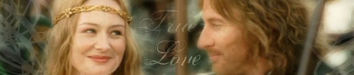
This is the banner I"m using,
Now, depending on the effect you want to use you'd go to that, I think I'll choose a Blur.
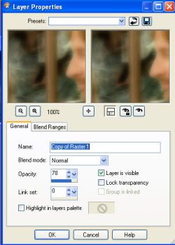
Go to Adjust>>>Blur>>Gaussian Blur. I set my radius to 5, but usually between 5-7 looks good. Now I went to Layers>>>Properties and you can set them like mine, or change, it just depends on how much you want it to stand out.
At this point, your banner or image, should be a little blurry and soft around the edges. Now I"m going to use my eraser, and erase the softened look from the images I want to stand out more. So now all I do is add my text and a brush or two I"m done.
You can do the same with with almost any of the Effects under the Effects tab. Or Play around with Blurs, Softeness and Sharpeness.
I hope that made sense... _________________ <center> Proud Member many Clubs (specially the Nazgul Club) Nazgul #3
</center>
|
|
| Top |
|
|
Who is online |
Users browsing this forum: No registered users and 21 guests |
|
You cannot post new topics in this forum
You cannot reply to topics in this forum
You cannot edit your posts in this forum
You cannot delete your posts in this forum
You cannot post attachments in this forum
|
Powered by phpBB © 2000, 2002, 2005, 2007 phpBB Group
Boyz theme by Zarron Media 2003
|
|


