| Author |
Message |
|
|
Post subject:  Posted: Posted: March 11th, 2011, 8:20 pm |
|
Joined: 04 February 2006
Posts: 9445
Location: Southeast of the Northern part of West Hyglemr
Country: ")
Gender: Female

|
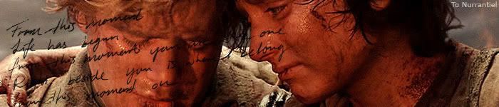
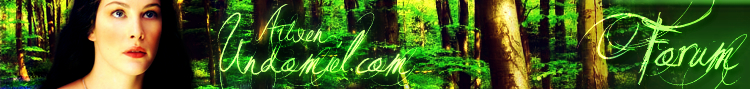
I like the first image the most, at the moment. The colors stand out well and so forth. Also, I think the tree provides a nice balance for Arwen. I wouldn't try to integrate it too much, because it helps the eye move around the image.
Also: Arwen the webmaster wrote: Text - love the font. Would definitely recommend NOT making it green, though. One of my biggest self-criticisms for the current layout is that the site title doesn't stand out nearly enough. Site regulars will be able to read it; newbies, not so much. Maybe try more of a screened effect, or even a white-to-light-blue type of gradient to tie the text in with the bluebells/dress. A faint bevel could help it seem less flat as well.
I definitely agree with this.
With the links: I quite like the 4.1 and 4.3 layouts, as they provide enough of a contrast from the main image to set the links apart. But I think with this, a sort of screened whitish bar would probably be fine. Yeah. I think you have a good handle on color though. 
Oh! And some of the links were changing I forgot about that. The links that you'll need to put on the header are:
Home
Books
Film
Media
Elvish
Links
Site
Chat
Gallery
Awards
Fun
Misc _________________ going on a journey through my old claims
|
|
| Top |
|
 |
|
|
Post subject: Posted: March 11th, 2011, 8:46 pm |
|
Joined: 10 July 2005
Posts: 23149
Location: Where there are handsome heroes and sexy villains.. all that need some lovin' ;)
Country: ")
Gender: Female
|
|
| Top |
|
|
|
|
Post subject: Posted: March 12th, 2011, 3:28 am |
|
Joined: 04 June 2005
Posts: 13518
Location: Skógum Svíþjóðar
Country: ")
Gender: Female
|
|
| Top |
|
|
|
|
Post subject: Posted: March 12th, 2011, 4:37 am |
|
Joined: 03 May 2005
Posts: 4717
Location: Middle-earth
Country: ")
Gender: Female
|
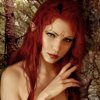
Aww, you mean you don't think http://www.dafont.com/jellyka-love-and- ... domiel.com would be a good choice? 
A lot of the others are really gorgeous, though, especially the Vampire Street one Eru suggested, as long as it's legible enough. JF, maybe once you get the graphic narrowed down to the text bit, you could experiment with drop caps and possibly text on a path to make it more interesting. Nothing too extreme (yeah, the whole waving-flag-ish text-on-a-path thing...maybe not so much xD) but it could add interest. _________________ 
|
|
| Top |
|
|
|
|
Post subject: Posted: March 12th, 2011, 2:07 pm |
|
Joined: 27 February 2006
Posts: 11433
Location: My Imagination
Country:
Gender: Female
|
|
I like the first banner as well, and agree with Arweb on most of the things she said about the banners.
And I love the vampire font that Eru chose!
I think you all are doing a great job with planning out the majority of the banner. But what about the hobbits? I know they kind of snuck their way into the banner, but they don't seem to fit very well to me, and for the most part, unless you know what it is before, it's hard to tell it's actually hobbits. So... what are we going to do about the hobbits? Wouldn't we want something that you can tell they're hobbits, but they're not the focal point, either?
_________________ 
(}--{)Imagination Inspires Ideas -Zandain(}--{)
Married Cloud Strife 9/17/08
|
|
| Top |
|
|
|
|
Post subject: Posted: March 12th, 2011, 5:54 pm |
|
Joined: 30 December 2006
Posts: 3507
Location: Over the Edge of the Wild
Country:
Gender: Female
|
|
^I agree with Raina, the hobbits should be more prominent (without overshadowing Arwen), or not there at all.
_________________
by Lembas
|
|
| Top |
|
|
|
|
Post subject: Posted: March 12th, 2011, 5:58 pm |
|
Joined: 10 July 2005
Posts: 23149
Location: Where there are handsome heroes and sexy villains.. all that need some lovin' ;)
Country:
Gender: Female
|
|
| Top |
|
|
|
|
Post subject: Posted: March 12th, 2011, 5:59 pm |
|
Joined: 04 June 2005
Posts: 13518
Location: Skógum Svíþjóðar
Country:
Gender: Female
|
I'm glad more people are loving the Vampire Street font! 
And yeah I agree about the Hobbits, if you're going to have them in the banner make sure you can tell at first glance that they're actually there without taking the focus off Arwen! _________________ 
.*+I'VE MET ANTIGONE, MONTANABOHEMIAN, RAIVYNN PHOENIX, BERIADANWEN & PIRATEOFTHERINGS+*.
(¯`•¸·´¯`·._.·[TRUE VAMPIRES DON'T SPARKLE]·._.·´¯`·¸•´¯)
|
|
| Top |
|
|
|
|
Post subject: Posted: March 12th, 2011, 7:14 pm |
|
Joined: 30 December 2006
Posts: 3507
Location: Over the Edge of the Wild
Country:
Gender: Female
|
I think it'd be nice if it were like "ooh, pretty!Arwen. wait what's that? hobbits! that is so cool!  " if you catch my drift  _________________
by Lembas
|
|
| Top |
|
|
|
|
Post subject: Posted: March 12th, 2011, 7:19 pm |
|
Joined: 10 July 2005
Posts: 23149
Location: Where there are handsome heroes and sexy villains.. all that need some lovin' ;)
Country:
Gender: Female
|
|
| Top |
|
|
|
|
Post subject: Posted: March 12th, 2011, 7:29 pm |
|
Joined: 30 December 2006
Posts: 3507
Location: Over the Edge of the Wild
Country:
Gender: Female
|
|
^yeah, there would be no point in having a hobbit there if he looked completely out of place. it doesn't have to be large though, it's just with the one you did before you couldn't really tell they were hobbits because their backs were turned.
_________________
by Lembas
|
|
| Top |
|
|
|
|
Post subject: Re: A-U Revival: layout & coding Posted: March 19th, 2011, 5:18 pm |
|
Joined: 10 July 2005
Posts: 23149
Location: Where there are handsome heroes and sexy villains.. all that need some lovin' ;)
Country:
Gender: Female
|
Ok, so I tried again with the header this afternoon.
First thing you should (hopefully) notice is that I used a different background but still kept with the bluebell theme. I know the last background image was pretty well liked, but I thought maybe one more attempt with a different image, to give you guys another option. I personally really like this image, although I think it is more blue, it just looks... prettier to me... ... although harder to get the colours right.
Anyway, as you can see it is the bare bones, no text, no Hobbits, no nothin'. I *think* this header will be easier to incoporate any Hobbits (I was thinking maybe Gandalf + Sam + Frodo = Halfing and Gandalf on epic journey = The Hobbit?) but I haven't even begun to look at images, so I guess time will tell.
I really tried to get Arwen's hair to look like it wasn't just a black puffball. Hopefully you can see some definition there now and it suits the whole image better than it just being big and black. I also experimented with how to get the rest of the header glowy (if people want that) whilst still keeping her hair, non-black and pouffy.
Getting the dress to match these particular bluebells was actually harder than can be believed, and while they are not the perfect matches, I think they look OK. But I will try again if needs be.
Also, just for the heck of it, there is a version with a bit of "lighting". I tried various things to get a look of the sun on Arwen, and nothing looked right to me at all. This, I kinda like, but probably not for AU.
And as AU won't allow anything to be posted other than 700xwhatever, the headers are now all links.
http://img842.imageshack.us/img842/1882/headerkar.png
^ This is the basic header. Arwen + bluebells. Ta-da!
http://img268.imageshack.us/img268/9393/header1z.png
^ The glowy one. Tried to keep as much detail to Arwen's hair, as I said and the soft blue does also do a lot for the colours of the bluebells and the dress.
http://img13.imageshack.us/img13/7940/header2cl.png
^ This is the slightly different version, with the blue lighting on the side. No idea what the light might represent but I do quite like it and it gives the picture a little *oomph*, but again, maybe not for AU.
So if enough people scream "perfecto", then I can get to work on the font and really play around with colours/etc.
_________________ 

^ By me and my SS *squiggle hugs*
|
|
| Top |
|
|
|
|
Post subject: Re: A-U Revival: layout & coding Posted: March 19th, 2011, 5:23 pm |
|
Joined: 18 March 2011
Posts: 88
Location: The Netherlands
Country: ")
Gender: Male
|
They look lovely, but as a logo for this forum i would like to see more blue, the green might look awkward ^^ But great graphic. _________________ 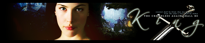
With love, by Lembas.
'The rewards of flirting are more greater than the risks, be sexy and provocative.'
|
|
| Top |
|
|
|
|
Post subject: Re: A-U Revival: layout & coding Posted: March 19th, 2011, 5:41 pm |
|
Joined: 30 December 2006
Posts: 3507
Location: Over the Edge of the Wild
Country:
Gender: Female
|
|
That looks great, JF. I personally like the third one best. And the first, except I don't really get the same feeling of Arwen standing in the forest that I get from the other two. The second is pretty too, but I feel like it has a bit too much of an icy feel, not very forest-y. So, yeah.
Also, GoldStrike: The website's going to go green, so that's why the header is green-y.
_________________
by Lembas
|
|
| Top |
|
|
|
|
Post subject: Re: A-U Revival: layout & coding Posted: March 19th, 2011, 5:51 pm |
|
Joined: 03 May 2005
Posts: 4717
Location: Middle-earth
Country:
Gender: Female
|
These are looking great, JF! I think right now the first one's my favorite. The second one is pretty, but screams "banner effects!" a little too much - I think a more natural look might be nice. I like where you're going with the lighting on the third one, but it's a little yellowy-green for my taste - especially for skintones, it creates a look more sickly than luminescent healthy elf. (Okay, at this point, maybe Arwen should look sickly since she's going all mortal and everything...but anyway ) You did a wonderful job keeping more detail in the hair! I'd add a liiiiiittle bit more contrast though to get some true black in there, though, because it looks a little washed out right now. Maybe you could dodge the highlights to make them stand out a bit and darken the rest? The blue of her dress against the bluebells looks amazing. It's a bit of a hard picture to cut out while making the edge look natural, so I'd still recommend making the immediate background just a teensy bit darker - maybe take the burn brush on a really low, soft setting and gradually darken the area right around her. Or you could try darkening the whole background, but I think it would help to blend things a little more. You could try including some of the background of the original Arwen image at low opacity, too. Ah, and just as a thought, I looked at the third version again, and I really do like the contrast on this one more. Maybe you could diffuse-glowify some of the skin tones and the silver trim on the dress to make them a little less yellowy? Or selectively shift the hue or saturation? By the way, do you want to get rid of her peeping bra strap? Fantastic job! Btw, I changed the image settings to allow pictures up to 750px wide, so you can include the headers inline if you want _________________
|
|
| Top |
|
|
|
|
Post subject: Re: A-U Revival: layout & coding Posted: March 19th, 2011, 6:10 pm |
|
Joined: 10 July 2005
Posts: 23149
Location: Where there are handsome heroes and sexy villains.. all that need some lovin' ;)
Country:
Gender: Female
|
|
| Top |
|
|
Who is online |
Users browsing this forum: No registered users and 10 guests |
|
You cannot post new topics in this forum
You cannot reply to topics in this forum
You cannot edit your posts in this forum
You cannot delete your posts in this forum
You cannot post attachments in this forum
|
Powered by phpBB © 2000, 2002, 2005, 2007 phpBB Group
Boyz theme by Zarron Media 2003
|
|


 *downloads for self*


