| Author |
Message |
|
|
Post subject: Re: A-U Revival: layout & coding  Posted: Posted: March 19th, 2011, 9:25 pm |
|
Joined: 10 July 2005
Posts: 23149
Location: Where there are handsome heroes and sexy villains.. all that need some lovin' ;)
Country: ")
Gender: Female

|
Ok, I'm back again. 
Well PSP went weird on me, which meant I could only backtrack to edit things to far... majorly annoying. So if there are any minor colour differences that I don't mention here, it's because I pretty much had to start from scratch again I couldn't remember exactly what I'd done before. 
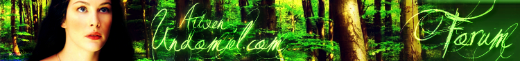
So anyway.... I changed the colour of Arwen's skin from a yellow to a more normal tone. I also changed the yellow tone of the braiding around her dress to the silvery colour it actually is in the original image. I also removed the "bra strap":P and removed some of the very blue lighting on her hair. The colours have brightened slightly, on the flowers and also it looks brighter because Arwen hasn't got jaundice anymore.
The hair is the killer. I added contrast which helped, but anymore would have given it a lovely black look but with no accent on the hair. So... I think either way here, not by me doing it anyway  , I think we either go for jet black and no definition, or how it is now, with a slight blue tinge (depending the position of your screen) but still being able to see actual hair strands. Sort of. , I think we either go for jet black and no definition, or how it is now, with a slight blue tinge (depending the position of your screen) but still being able to see actual hair strands. Sort of.
So, this is the before and after shot.


_________________ 

^ By me and my SS *squiggle hugs*
|
|
| Top |
|
 |
|
|
Post subject: Re: A-U Revival: layout & coding Posted: March 19th, 2011, 10:18 pm |
|
Joined: 03 May 2005
Posts: 4717
Location: Middle-earth
Country: ")
Gender: Female
|
Oh, that's gorgeous! And it looks so much better with the yellow color cast removed from the skin! The rich black for the hair looks great - you can still see some details in her hair, which I think is all you really need. The only things I would point out at this point (pointpointpoint  ) are that the extreme shadows on the trees should probably match the value of the darkest bits of hair - more like the shadows the background has in the before picture, I think. And the only only bit that draws my attention in a more negative way is that bit of wavy hair on the left (well, Arwen's right). If it could be blended a little more, more like this:  ...which is a poor attempt since I don't have the layers to work with, but you can see what I'm talking about. Maybe? Really really amazing work _________________ 
|
|
| Top |
|
|
|
|
Post subject: Re: A-U Revival: layout & coding Posted: March 19th, 2011, 10:58 pm |
|
Joined: 10 July 2005
Posts: 23149
Location: Where there are handsome heroes and sexy villains.. all that need some lovin' ;)
Country:
Gender: Female
|
|
Yep, I will see what I can do with the hair. I can't believe actually I have been merging all the layers as I have been going along. My bad. So I will do what I can with the hair... when I go back and find the hair layer I merged yonks ago. I quite like how the curls look though, as unlike the rest of her hair, it's definite, if you know what I mean?
Hmm... I can't see any difference between the before and after versions. Maybe it's my screen or something. Are there any particular areas you see that should be darker?
_________________
^ By me and my SS *squiggle hugs*
|
|
| Top |
|
|
|
|
Post subject: Re: A-U Revival: layout & coding Posted: March 20th, 2011, 7:28 am |
|
Joined: 30 December 2006
Posts: 3507
Location: Over the Edge of the Wild
Country: ")
Gender: Female
|
This looks brilliant, JF  Gimli wrote:
The hair is the killer. I added contrast which helped, but anymore would have given it a lovely black look but with no accent on the hair. So... I think either way here, not by me doing it anyway , I think we either go for jet black and no definition, or how it is now, with a slight blue tinge (depending the position of your screen) but still being able to see actual hair strands. Sort of.And I think that if you take in to consideration that we're having her be surrounded by bluebells with the sun on her face, it's only natural that there's some blue reflections  (maybe not exactly where the blue is right now, but we won't mention that  ) _________________
by Lembas
|
|
| Top |
|
|
|
|
Post subject: Re: A-U Revival: layout & coding Posted: March 20th, 2011, 1:17 pm |
|
Joined: 10 July 2005
Posts: 23149
Location: Where there are handsome heroes and sexy villains.. all that need some lovin' ;)
Country:
Gender: Female
|
Thanks Ana. Lol, we won't mention it. 
So I couldn't do anything with the hair. *sad face* And I definitely can't do much with last nights work as Pain crashed on me (just when I thought re-uploading it to a NEW computer would solve all it's glitches). So for the moment, what you see is what you get, unless anyone wants really big changes that I can only do by re-making the whole thing.
Anyway, here is another version of the header (same as last night) with a little addition.
 Ok, so whadda we got? I spent ages last night (to the point where I physically could not look anymore for fear of my health and mental stability) to find out how to make a tube for the Evenstar pendant. Should be easy to find no? Wrong. Tried again this afternoon, first site I clicked on, nice instructions that actually worked. *head desk* Worst part is, whilst making it, I knew, that I knew deep down what to do. *double head desk* So I tried with the necklace, to find one with a shape that would git Arwen's neck, not too wide etc. Bit of a bummer that her left side is darker so you wouldn't naturally see the necklace with all the shadow, which is why the necklace looks a little uneven. But such is life. It looked weird trying to make it seem perfect, as that's not really how it would look. I also tried to make a little dip over the collarbone, but with it being so near the "end" of the necklace, it was an unnecessary eye-catcher so I scrapped that. I'm undecided if it needs more colour, or it looks to flat or ot needs more oomph. I don't even know if you guys like it yet. I have messed around with contrast and stuff so I'm not sure what else to do with it. I've never got the hang of inner bevel - just before it is mentioned, lol.  But if I need to read up on it to get the right level of .... levelness, I will do so. *salutes*[/color]
_________________
^ By me and my SS *squiggle hugs*
|
|
| Top |
|
|
|
|
Post subject: Re: A-U Revival: layout & coding Posted: March 20th, 2011, 1:38 pm |
|
Joined: 30 December 2006
Posts: 3507
Location: Over the Edge of the Wild
Country:
Gender: Female
|
I think it's a nice touch with the pendant, but I personally think it looks a little out of place, so if we're keeping it, it needs to look more natural. I'm not sure what makes it look weird, but I think maybe it's too icy-shiny compared to the rest? What with her standing in the sun, you'd think it would reflect light that's a little bit warmer, you know? Also if you could maybe tilt it a little so that it looks more like it rests on her chest rather than hangs loosely from her neck. I don't know how difficult this is (I wouldn't be able to do any of it, myself) but I'm just making suggestions that I think may improve it even more. Feel free to disregard them as you see fit _________________
by Lembas
|
|
| Top |
|
|
|
|
Post subject: Re: A-U Revival: layout & coding Posted: March 20th, 2011, 3:34 pm |
|
Joined: 03 May 2005
Posts: 4717
Location: Middle-earth
Country:
Gender: Female
|
Here's the only thing I was talking about:  The left one is the one where I darkened the background just around the hair a bit; the right one is your original. Personally, I think it looks more naturally blended when darker, but it's not a huge deal I LOVE the idea of the Evenstar, but I think it needs a little work to look natural  Arwen is turned slightly to our left / her right in the shot, whereas the Evenstar is fully centered, so the perspective is a little off. It also needs to follow the natural contours of the shadows/highlights of her neck to look natural. You might be able to do this by dodging/burning areas accordingly. Not sure if PSP has perspective tools like Photoshop, though. If you could get it to look more natural, it would be a great touch! It's really nice with the silver trim on her dress _________________
|
|
| Top |
|
|
|
|
Post subject: Re: A-U Revival: layout & coding Posted: March 20th, 2011, 3:41 pm |
|
Joined: 10 July 2005
Posts: 23149
Location: Where there are handsome heroes and sexy villains.. all that need some lovin' ;)
Country:
Gender: Female
|
|
| Top |
|
|
|
|
Post subject: Re: A-U Revival: layout & coding Posted: March 20th, 2011, 3:49 pm |
|
Joined: 30 December 2006
Posts: 3507
Location: Over the Edge of the Wild
Country:
Gender: Female
|
|
I think if we're being perfectionists, you could probably let the chain hang a little looser on her right side (from our point of view). What I mean is, it's very close to her neck right now, and it might look better if it were just a teensy bit further out towards her shoulder. That might help it look like the chain is resting against her skin.
_________________
by Lembas
|
|
| Top |
|
|
|
|
Post subject: Re: A-U Revival: layout & coding Posted: March 20th, 2011, 4:13 pm |
|
Joined: 10 July 2005
Posts: 23149
Location: Where there are handsome heroes and sexy villains.. all that need some lovin' ;)
Country:
Gender: Female
|
|
| Top |
|
|
|
|
Post subject: Re: A-U Revival: layout & coding Posted: March 20th, 2011, 4:28 pm |
|
Joined: 04 June 2005
Posts: 13518
Location: Skógum Svíþjóðar
Country: ")
Gender: Female
|
I kind of prefer the way the chain sits in the first picture rather than the second one. And if we're going to be perfectionists (which I am terribly guilty of), the Evenstar itself still looks like a flat pasted clip-art. Maybe try add a slight subtle drop shadow or something to give it a bit more dimension? I really like what you're trying to do though, JF. _________________ 
.*+I'VE MET ANTIGONE, MONTANABOHEMIAN, RAIVYNN PHOENIX, BERIADANWEN & PIRATEOFTHERINGS+*.
(¯`•¸·´¯`·._.·[TRUE VAMPIRES DON'T SPARKLE]·._.·´¯`·¸•´¯)
|
|
| Top |
|
|
|
|
Post subject: Re: A-U Revival: layout & coding Posted: March 20th, 2011, 4:31 pm |
|
Joined: 30 December 2006
Posts: 3507
Location: Over the Edge of the Wild
Country:
Gender: Female
|
ErulissëEnethNîn wrote: I kind of prefer the way the chain sits in the first picture rather than the second one. And if we're going to be perfectionists (which I am terribly guilty of), the Evenstar itself still looks like a flat pasted clip-art. Maybe try add a slight subtle drop shadow or something to give it a bit more dimension? I really like what you're trying to do though, JF. I actually have to agree about the chain. It looks better the way it was before... _________________
by Lembas
|
|
| Top |
|
|
|
|
Post subject: Re: A-U Revival: layout & coding Posted: March 20th, 2011, 4:33 pm |
|
Joined: 04 June 2005
Posts: 13518
Location: Skógum Svíþjóðar
Country:
Gender: Female
|
You can always try to find a picture of Liv wearing the Evenstar and try to blend that in with the picture you've got. Here's one: http://www.very-faery.com/costume/image ... wenbig.jpg_________________
.*+I'VE MET ANTIGONE, MONTANABOHEMIAN, RAIVYNN PHOENIX, BERIADANWEN & PIRATEOFTHERINGS+*.
(¯`•¸·´¯`·._.·[TRUE VAMPIRES DON'T SPARKLE]·._.·´¯`·¸•´¯)
|
|
| Top |
|
|
|
|
Post subject: Re: A-U Revival: layout & coding Posted: March 20th, 2011, 5:07 pm |
|
Joined: 03 May 2005
Posts: 4717
Location: Middle-earth
Country:
Gender: Female
|
The blending around the hair looks much better Thanks! I agree with Eru - I think it might be easier to cut out the Evenstar from a nice high-res shot of Arwen already wearing it rather than trying to render it from scratch. It's reeeeeally hard to get these things to look natural. You could also try google-image-searching a picture of a normal necklace-chain sitting on someone's neck and attach a cut-out of the Evenstar to that. Ah, and if you try to work with the tube version, look at a picture like the one Eru posted for reference. You'll see some details that will make a huge difference. For instance, the chain comes down to a point where the Evenstar hangs rather than falling in a loop like you have it. You can also see the shadow of the necklace on Arwen's neck, and how the chain/pendant are highlighted on the left and shadowed on the right. Details like these are what it makes it realistic. _________________
|
|
| Top |
|
|
|
|
Post subject: Re: A-U Revival: layout & coding Posted: March 20th, 2011, 5:22 pm |
|
Joined: 10 July 2005
Posts: 23149
Location: Where there are handsome heroes and sexy villains.. all that need some lovin' ;)
Country:
Gender: Female
|
|
| Top |
|
|
|
|
Post subject: Re: A-U Revival: layout & coding Posted: March 20th, 2011, 5:32 pm |
|
Joined: 30 December 2006
Posts: 3507
Location: Over the Edge of the Wild
Country:
Gender: Female
|
I don't think you need to worry about holding stuff up. It seems like work has dried up a little bit. I've got tomorrow off from school, so I'm thinking I'll try and pm a few people to hear how they're doing with their work and encourage them to keep up their spirits And you're doing really brilliant work, and really important work because it's what people will be looking at when they enter the site, so I personally think it's perfectly okay to take a lot of time to get it right. Which you are, btw. It's going to look amazing in the end _________________
by Lembas
|
|
| Top |
|
|
Who is online |
Users browsing this forum: No registered users and 23 guests |
|
You cannot post new topics in this forum
You cannot reply to topics in this forum
You cannot edit your posts in this forum
You cannot delete your posts in this forum
You cannot post attachments in this forum
|

Powered by phpBB © 2000, 2002, 2005, 2007 phpBB Group
Boyz theme by Zarron Media 2003
|
|


