| Author |
Message |
|
|
Post subject: Character banner  Posted: Posted: June 25th, 2005, 9:16 pm |
|
Joined: 03 June 2005
Posts: 4977

|
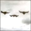
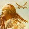
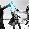
Ok, I'm really proud of this character banner I just made, and I just wanted to know what others thought of it.
 _________________ <center> 
 </center>
Last edited by Raven Sparrow on June 26th, 2005, 2:47 pm, edited 1 time in total.
|
|
| Top |
|
 |
|
|
Post subject: Woa... Posted: June 25th, 2005, 9:58 pm |
|
Joined: 21 June 2005
Posts: 68
|
It's so amazing I can hardly believe it, how's that?  Seriously, I don't know how you do it...I wish I could make graphics like that.  _________________ God have mercy...Christ have mercy...*sign of the cross*


|
|
| Top |
|
|
|
|
Post subject: Posted: June 26th, 2005, 1:48 am |
|
Joined: 21 June 2005
Posts: 30
Location: California
|
|
It's quite lovely. Such beautiful colors. The only suggestion I might make is a little less text. It's a bit overwhelming to look at it and see all that text. But it's such a lovely banner otherwise ... and the text is interesting.
~*~Byrd~*~
_________________
"Know, think, choose, do." -<i>Ender's Shadow</i>
|
|
| Top |
|
|
|
|
Post subject: Posted: June 26th, 2005, 6:13 am |
|
Joined: 04 June 2005
Posts: 1062
Location: Go ahead and guess.. Here's a clue: I'm somewhere on earth
|
I agree with Byrd, I just think there's to many text.. I think maybe if the text's opacity is less like 70% or 60% it might be better.. but either than that it's an amazing banner!  _________________ <center> 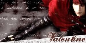 Status:
 Suffering from a slow internet connection. =P</center>
|
|
| Top |
|
|
|
|
Post subject: Posted: June 26th, 2005, 8:17 am |
|
Joined: 04 June 2005
Posts: 659
|
|
wow that banner is awesome!~
_________________ 
|
|
| Top |
|
|
|
|
Post subject: Posted: June 26th, 2005, 10:20 am |
|
Joined: 03 June 2005
Posts: 4977
|
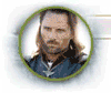
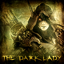
Yeah, now I see what you mean. I reworked it and got rid of some of the text, and I think it turned out better, and here's the other version.
_________________ <center>
</center>
|
|
| Top |
|
|
|
|
Post subject: Posted: June 26th, 2005, 10:23 am |
|
Joined: 04 June 2005
Posts: 4449
Location: Northern USA
|
very pretty!  _________________ 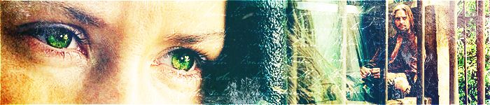
<center> icon & banner by me
skyward-thoughts</center>
|
|
| Top |
|
|
|
|
Post subject: Posted: June 26th, 2005, 10:25 am |
|
Joined: 03 June 2005
Posts: 4977
|
|
Thanks!
_________________ <center>
</center>
|
|
| Top |
|
|
|
|
Post subject: Posted: June 26th, 2005, 1:28 pm |
|
|
|
Ohhh...Cool banner my Elf friend!
|
|
| Top |
|
|
|
|
Post subject: Posted: June 26th, 2005, 1:36 pm |
|
Joined: 07 June 2005
Posts: 2370
Location: England, normally in my room
|
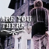
W00t, lyrics from my fave band, and one of my fave songs! Rock on Evanescence!
*ahem* Anyway, very pretty banner! But I agree with byrd, a little less text maybe? I think a couple of those lines would fit perfectly with the banner but I love the colours! Keep it up  _________________ <center>
|
|
| Top |
|
|
|
|
Post subject: Posted: June 26th, 2005, 8:16 pm |
|
Joined: 03 June 2005
Posts: 4977
|
|
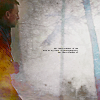
Thanks for the comments, and yeah, I see what you meant by all the text, so I redid it, and edited out some of the song.
_________________ <center>
</center>
|
|
| Top |
|
|
|
|
Post subject: Posted: June 27th, 2005, 11:22 am |
|
Joined: 04 June 2005
Posts: 13518
Location: Skógum Svíþjóðar
Country: ")
Gender: Female
|
|
oh wow it's very cool!! choice of colors excellent my friend, and the lyrical line really fits!! you should be proud of it, cause it's awesome
_________________ 
.*+I'VE MET ANTIGONE, MONTANABOHEMIAN, RAIVYNN PHOENIX, BERIADANWEN & PIRATEOFTHERINGS+*.
(¯`•¸·´¯`·._.·[TRUE VAMPIRES DON'T SPARKLE]·._.·´¯`·¸•´¯)
|
|
| Top |
|
|
|
|
Post subject: Posted: June 27th, 2005, 11:24 am |
|
Joined: 03 June 2005
Posts: 4977
|
|
Wow, thanks!
_________________ <center>
</center>
|
|
| Top |
|
|
|
|
Post subject: Posted: June 27th, 2005, 5:31 pm |
|
Joined: 24 June 2005
Posts: 261
Location: Right behind you... O_O
|
|
Your graphics are really neat and original, Aeriel!
_________________ The past is just the future with the lights on.
:: deviantart :: my drawings ::
|
|
| Top |
|
|
|
|
Post subject: Posted: June 28th, 2005, 5:10 pm |
|
Joined: 03 June 2005
Posts: 4977
|
|
Thanks!
_________________ <center>
</center>
|
|
| Top |
|
|
|
|
Post subject: Posted: June 28th, 2005, 5:42 pm |
|
Joined: 04 June 2005
Posts: 1505
Location: California
Country: ")
|
Wow, that's really good! Still, the words are a bit too small to be read - either you solve the problem by changing the font into something bigger and clearer, or take out even more text.
But it's terrific otherwise. Very original, as ~Twippo mentioned! _________________ 
|
|
| Top |
|
|
Who is online |
Users browsing this forum: No registered users and 1 guest |
|
You cannot post new topics in this forum
You cannot reply to topics in this forum
You cannot edit your posts in this forum
You cannot delete your posts in this forum
You cannot post attachments in this forum
|
Powered by phpBB © 2000, 2002, 2005, 2007 phpBB Group
Boyz theme by Zarron Media 2003
|
|