Arwen-Undomiel.com
https://arwen-undomiel.com/forum/

Eowyn Wallpaper
https://arwen-undomiel.com/forum/viewtopic.php?f=35&t=2926
Page 1 of 1

Author:  Gilraen Ringeril [ September 11th, 2005, 12:19 pm ]
Post subject:  Eowyn Wallpaper

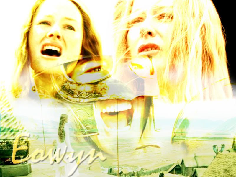
Hey, I made this Eowyn wallpaper the other day and I'm wondering if anyone likes it. I personally really like it and think it's pretty good. :) comments/constructive critsism are apriciated ;)!

http://i7.photobucket.com/albums/y252/G ... wallie.jpg

(you may use for personal use)

Author:  Blaithin [ September 11th, 2005, 2:29 pm ]
Post subject: 

Uhm...quite honestly, it is not terribly good. Oh, it has potential! It's a great start! But the composition and placing of pictures could be better-for instance, her lip looks like it's bleeding, though it's only the dark part of a helmet. I like the colorscheme though. All in all...I've seen better, but it could be a truly incredible piece with a small amount of editing:)

Author:  Gilraen Ringeril [ September 11th, 2005, 2:56 pm ]
Post subject: 

thanks for your critiques Blaithin :) I have to admit, I was just messing around, and I didn't think it was some great piece of artwork or anything

Author:  Beriadanwen [ September 11th, 2005, 7:23 pm ]
Post subject: 

I like it a lot -- It's very different from any other wallpapers I've seen and I think it's really nice

Author:  Gilraen Ringeril [ September 12th, 2005, 10:44 pm ]
Post subject: 

thanks Beriadanwen :)

Author:  Elberethsq [ September 16th, 2005, 10:49 pm ]
Post subject: 

Hmm . . . good color scheme as Blaithin pointed out. I do like it, seeing as how it is better than something I could have done. :blush: Perhaps if you darkened it a tiny bit more, it would look a bit better . . . great job otherwise. :bye2:

Author:  Gilraen Ringeril [ September 18th, 2005, 6:05 pm ]
Post subject: 

thanks Elberethsq :)

Author:  keyodie [ September 26th, 2005, 12:13 am ]
Post subject: 

I love it!!! The only suggestions I would make, is maybe you could kinda erase the part of the helmet that makes the other pic look like her lip is bleeding...and also, on the right, I think it might look better if it is white.

But it's great!!! Good job!!!!

Author:  Maetharanel [ September 26th, 2005, 12:19 pm ]
Post subject: 

Overall I like it... the only thing I'd change, besides what people already said, is the text. I would have picked a different font - Texas Hero, maybe. Sort of like in this wallpaper: http://img221.imageshack.us/img221/6528/rotr0ka.jpg

Just keep practicing, and before you know it, you'll be the best graphic maker on the forum! :-D

Page 1 of 1 All times are UTC - 5 hours [ DST ]
Powered by phpBB © 2000, 2002, 2005, 2007 phpBB Group
http://www.phpbb.com/