| Author |
Message |
|
|
Post subject: Re: A-U Revival: layout & coding  Posted: Posted: March 24th, 2011, 8:53 pm |
|
Joined: 04 June 2005
Posts: 13518
Location: Skógum Svíþjóðar
Country: ")
Gender: Female

|
_________________ 
.*+I'VE MET ANTIGONE, MONTANABOHEMIAN, RAIVYNN PHOENIX, BERIADANWEN & PIRATEOFTHERINGS+*.
(¯`•¸·´¯`·._.·[TRUE VAMPIRES DON'T SPARKLE]·._.·´¯`·¸•´¯)
|
|
| Top |
|
 |
|
|
Post subject: Re: A-U Revival: layout & coding Posted: March 24th, 2011, 9:16 pm |
|
Joined: 10 July 2005
Posts: 23149
Location: Where there are handsome heroes and sexy villains.. all that need some lovin' ;)
Country: ")
Gender: Female
|
|
| Top |
|
|
|
|
Post subject: Re: A-U Revival: layout & coding Posted: March 24th, 2011, 9:52 pm |
|
Joined: 03 June 2005
Posts: 13144
Location: Heaven: Rockin' with Severus Snape
Country: ")
Gender: Female
|
I know I haven't much been involved in this, but I LOVE Jellyka Vampire Street [either the first or last option]. 
|
|
| Top |
|
|
|
|
Post subject: Re: A-U Revival: layout & coding Posted: March 24th, 2011, 10:46 pm |
|
Joined: 04 February 2006
Posts: 9445
Location: Southeast of the Northern part of West Hyglemr
Country: ")
Gender: Female
|
And, to round it out, I quite like the Tagettes one.  But placement wise I like the first option. @ Elberethsq: pretty much evening times are good for me, though it usually depends on the day. Don't let me hold anything up though. _________________ going on a journey through my old claims

|
|
| Top |
|
|
|
|
Post subject: Re: A-U Revival: layout & coding Posted: March 24th, 2011, 11:41 pm |
|
Joined: 16 March 2006
Posts: 20465
Location: Gondolin
Country: ")
Gender: Female
|
|
Daytimes are mostly better for me than evening. And this weekend would be a no-go for me.
_________________ 
|
|
| Top |
|
|
|
|
Post subject: Re: A-U Revival: layout & coding Posted: March 25th, 2011, 12:04 am |
|
Joined: 28 April 2006
Posts: 1519
Location: Oriendel, in the Woods of Amon Hen
Country: ")
Gender: Male
|
Elberethsq wrote: I don't mean to interrupt on the discussion for the images (great job by the way!), but this thread seems the best place to ask this: can we set up a brief meeting for the five coders to get together and discuss what we want to change and how? The coding discussion has kind of gotten loss in a multiplicity of threads so a live chat would really help in making speedy decisions. The AU chat would be pretty convenient, but I'm not sure about other people's schedule. Sometime next week perhaps? And as a reminder, the five coders I believe are: Haldir Johnny's Fan Nurrantiel Mashiara Telpeath Elberethsq I believe Eruraina had said that Haldir and I should work on the larger scale changes for the site, such as structure. Telpeath seems to have quite a bit of experience, so he should probably join in on those changes too. Then Nurrantiel and JF will work on smaller changes (updating links, fixing images, whatever). Once we meet, we can decide what big changes we want for the site, how to do them, who does what, and plan out a rough schedule to carrying out those changes. Then we can ask Arweb for server access.  It really depends when I can meet, because of school and such. Weekends are mostly a sure - save for the next couple weeks as I will be working on our school opera. The other issue that I am foreseeing is Time Zone issues. I am housed in the US [Central Standard Time], so I'm not sure how that might conflict. I can work around anything, so let me know. I am excited to be working on this project with you all - collaborations are a lot of fun. _________________ Annoying-Amount-of-Smileys Nazgul
Co-Force of Evil Posting

|
|
| Top |
|
|
|
|
Post subject: Re: A-U Revival: layout & coding Posted: March 25th, 2011, 4:37 am |
|
Joined: 30 December 2006
Posts: 3507
Location: Over the Edge of the Wild
Country:
Gender: Female
|
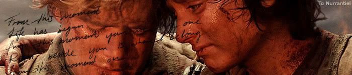
Eru: I really like the Vampire Street font, but I'm not sure it stands out enough from the background. I know you said you'd work more on them, so with that one my advice would be to make it "pop" more. The Hobbiton brush is nice, but I'm not sure whether I think it works with the picture to be honest. I also really like the one in the big picture, but I'd move it a bit farther up so it doesn't weigh quite as heavily on top of Frodo, if you know what I mean. It looks a bit like it's just about to land on top of him _________________
by Lembas
|
|
| Top |
|
|
|
|
Post subject: Re: A-U Revival: layout & coding Posted: March 25th, 2011, 6:27 am |
|
Joined: 04 June 2005
Posts: 13518
Location: Skógum Svíþjóðar
Country:
Gender: Female
|
Thanks for all your feedback, guys! I take it that the top left hand side of the banner is the best place to put the text but we all have different opinions on what font to use. I'll make a few more variations tonight, using the same three fonts but putting them all in the top left corner in various constellations and sizes. And yes, Ana, if Vampire Street is the one we're going for, I am definitely going to make it pop. I had already planned on it. _________________
.*+I'VE MET ANTIGONE, MONTANABOHEMIAN, RAIVYNN PHOENIX, BERIADANWEN & PIRATEOFTHERINGS+*.
(¯`•¸·´¯`·._.·[TRUE VAMPIRES DON'T SPARKLE]·._.·´¯`·¸•´¯)
|
|
| Top |
|
|
|
|
Post subject: Re: A-U Revival: layout & coding Posted: March 25th, 2011, 7:23 pm |
|
Joined: 10 July 2005
Posts: 23149
Location: Where there are handsome heroes and sexy villains.. all that need some lovin' ;)
Country:
Gender: Female
|
|
| Top |
|
|
|
|
Post subject: Re: A-U Revival: layout & coding Posted: March 26th, 2011, 9:08 am |
|
Joined: 04 June 2005
Posts: 13518
Location: Skógum Svíþjóðar
Country:
Gender: Female
|
OK I know I said I was going to make some more variations using the three fonts, but I went straight to doing various effects on Vampire Street, just to see what it would look like (and most people seemed to like it). Again, these are not definite in any way. Just experimenting. But I'd like to point out that I probably won't be able to integrate the text with the layers since I'm using Fireworks and it usually doesn't recognize working files from other softwares (it flats the layers into one image). So no matter what I do, it's going to appear like it sits on top. I also wanted to do the transparent glowy effect (like the current A-U banner) but it did not look good at all since the forest background shifts so much in contrast and color. If anyone else wants to have a go at the text as well, be my guest!       Like the placement but not the effects? Like an effect but not the placement? Like none of them? Let me know. And again, if someone else wants to have a go at it - go for it! I think we would only benefit from having more creative minds experiment with the text. _________________
.*+I'VE MET ANTIGONE, MONTANABOHEMIAN, RAIVYNN PHOENIX, BERIADANWEN & PIRATEOFTHERINGS+*.
(¯`•¸·´¯`·._.·[TRUE VAMPIRES DON'T SPARKLE]·._.·´¯`·¸•´¯)
|
|
| Top |
|
|
|
|
Post subject: Re: A-U Revival: layout & coding Posted: March 26th, 2011, 9:35 am |
|
Joined: 18 March 2011
Posts: 88
Location: The Netherlands
Country: ")
Gender: Male
|
|
Just a tip. Try to put the opacity of the text on about 75 or 80% It will look much better that way. ^^ And personally i liked the text without the glowing stuff way more. This looks a bit awkward. No offence of course!
_________________ 
With love, by Lembas.
'The rewards of flirting are more greater than the risks, be sexy and provocative.'
|
|
| Top |
|
|
|
|
Post subject: Re: A-U Revival: layout & coding Posted: March 26th, 2011, 11:25 am |
|
Joined: 30 December 2006
Posts: 3507
Location: Over the Edge of the Wild
Country:
Gender: Female
|
Just looking quickly through them, the white+blue one is my favourite (No. 3). I'll have a closer look when I have more time, though _________________
by Lembas
|
|
| Top |
|
|
|
|
Post subject: Re: A-U Revival: layout & coding Posted: March 27th, 2011, 9:04 pm |
|
Joined: 04 February 2006
Posts: 9445
Location: Southeast of the Northern part of West Hyglemr
Country:
Gender: Female
|
|
I like the 4th and 6th the most. The subtle glow is nice.
_________________ going on a journey through my old claims
|
|
| Top |
|
|
|
|
Post subject: Re: A-U Revival: layout & coding Posted: March 27th, 2011, 9:26 pm |
|
Joined: 04 June 2005
Posts: 13518
Location: Skógum Svíþjóðar
Country:
Gender: Female
|
Thanks guys for the feedback. I'd love for someone else to have a go at the text as well! Anyone? _________________
.*+I'VE MET ANTIGONE, MONTANABOHEMIAN, RAIVYNN PHOENIX, BERIADANWEN & PIRATEOFTHERINGS+*.
(¯`•¸·´¯`·._.·[TRUE VAMPIRES DON'T SPARKLE]·._.·´¯`·¸•´¯)
|
|
| Top |
|
|
|
|
Post subject: Re: A-U Revival: layout & coding Posted: March 27th, 2011, 9:29 pm |
|
Joined: 27 February 2006
Posts: 11433
Location: My Imagination
Country:
Gender: Female
|
|
I must admit that I like the sixth one best(and the vampire text best). And that it's coming along great. There's just one thing that's bugging me... Arwen's right shoulder(her right, our left). And the black bumps there that I assume is hair. My eyes keep getting distracted by them. And it doesn't seem the smooth out very well with the background picture. But then again, that might just be me...
_________________ 
(}--{)Imagination Inspires Ideas -Zandain(}--{)
Married Cloud Strife 9/17/08
|
|
| Top |
|
|
|
|
Post subject: Re: A-U Revival: layout & coding Posted: March 27th, 2011, 9:39 pm |
|
Joined: 03 June 2005
Posts: 13144
Location: Heaven: Rockin' with Severus Snape
Country:
Gender: Female
|
I love the blue text without the glow. But yes, perhaps something can be done about opacity. It just seems to stick out too much. I'm not a graphics maker though, so I'm not sure how that works if it would look good at all.
|
|
| Top |
|
|
Who is online |
Users browsing this forum: No registered users and 12 guests |
|
You cannot post new topics in this forum
You cannot reply to topics in this forum
You cannot edit your posts in this forum
You cannot delete your posts in this forum
You cannot post attachments in this forum
|
Powered by phpBB © 2000, 2002, 2005, 2007 phpBB Group
Boyz theme by Zarron Media 2003
|
|