| Author |
Message |
|
|
Post subject: Re: A-U Revival: layout & coding  Posted: Posted: May 7th, 2011, 9:54 am |
|
Joined: 04 June 2005
Posts: 13518
Location: Skógum Svíþjóðar
Country: ")
Gender: Female

|
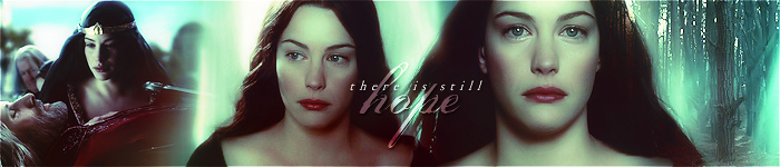
OK here are two different text versions. I've used the same text effects as on the forum header. This is about text placement now so let me know what looks best:   Or none of them? _________________ 
.*+I'VE MET ANTIGONE, MONTANABOHEMIAN, RAIVYNN PHOENIX, BERIADANWEN & PIRATEOFTHERINGS+*.
(¯`•¸·´¯`·._.·[TRUE VAMPIRES DON'T SPARKLE]·._.·´¯`·¸•´¯)
|
|
| Top |
|
 |
|
|
Post subject: Re: A-U Revival: layout & coding Posted: May 7th, 2011, 11:11 am |
|
Joined: 10 July 2005
Posts: 23149
Location: Where there are handsome heroes and sexy villains.. all that need some lovin' ;)
Country: ")
Gender: Female
|
i like the first one the most. i would just say though, if you could maybe move it a little more to the right so it's sitting slightly more over Frodo and see how that looks  _________________ 

^ By me and my SS *squiggle hugs*
|
|
| Top |
|
|
|
|
Post subject: Re: A-U Revival: layout & coding Posted: May 7th, 2011, 11:26 am |
|
Joined: 04 June 2005
Posts: 13518
Location: Skógum Svíþjóðar
Country:
Gender: Female
|
Like this, or is it too much?  _________________
.*+I'VE MET ANTIGONE, MONTANABOHEMIAN, RAIVYNN PHOENIX, BERIADANWEN & PIRATEOFTHERINGS+*.
(¯`•¸·´¯`·._.·[TRUE VAMPIRES DON'T SPARKLE]·._.·´¯`·¸•´¯)
|
|
| Top |
|
|
|
|
Post subject: Re: A-U Revival: layout & coding Posted: May 7th, 2011, 12:36 pm |
|
Joined: 30 December 2006
Posts: 3507
Location: Over the Edge of the Wild
Country: ")
Gender: Female
|
That's a bit too much in my opinion, but I definitely agree that that's the best version. If you try something in between those two placements, that'll probably look better _________________
by Lembas
|
|
| Top |
|
|
|
|
Post subject: Re: A-U Revival: layout & coding Posted: May 7th, 2011, 1:10 pm |
|
Joined: 03 May 2005
Posts: 4717
Location: Middle-earth
Country: ")
Gender: Female
|
It's looking really awesome! Like Ana, I think that the latest example is a wee bit too much to the right, but it's getting there really quickly  Maybe it would be perfectly placed if the point where the swirly from the O and the swirly from the M in .com meet was right above Frodo's head? Two minor points: any way we can make the swirlies a little bolder? (The ones from the U and N in Undomiel fade off into dotted lines  ) And is there any chance we can get a slightly less uniform green glow? Maybe varying shades of green, or a touch of blue mixed in? If not, it's no biggie. _________________ 
|
|
| Top |
|
|
|
|
Post subject: Re: A-U Revival: layout & coding Posted: May 7th, 2011, 1:32 pm |
|
Joined: 30 December 2006
Posts: 3507
Location: Over the Edge of the Wild
Country:
Gender: Female
|
Can I just say, after not having seen the header for so long, and now seeing it again, I can't even tell the pendant isn't supposed to be there. That is some perfect manip work, Arwen  _________________
by Lembas
|
|
| Top |
|
|
|
|
Post subject: Re: A-U Revival: layout & coding Posted: May 7th, 2011, 1:56 pm |
|
Joined: 10 July 2005
Posts: 23149
Location: Where there are handsome heroes and sexy villains.. all that need some lovin' ;)
Country:
Gender: Female
|
|
| Top |
|
|
|
|
Post subject: Re: A-U Revival: layout & coding Posted: May 7th, 2011, 2:29 pm |
|
Joined: 04 June 2005
Posts: 13518
Location: Skógum Svíþjóðar
Country:
Gender: Female
|
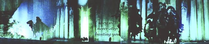
OK, here's a happy middle (not as far left as in the first option, but not as far right as in the second option):  And a slightly more blue-ish green version:  Arweb Arweb - I'll work on the swirls not being so 'dotted'. This is just about the color and the placement right now. Once we've decided on which way to go, I'll try my hands on the swirls! _________________
.*+I'VE MET ANTIGONE, MONTANABOHEMIAN, RAIVYNN PHOENIX, BERIADANWEN & PIRATEOFTHERINGS+*.
(¯`•¸·´¯`·._.·[TRUE VAMPIRES DON'T SPARKLE]·._.·´¯`·¸•´¯)
|
|
| Top |
|
|
|
|
Post subject: Re: A-U Revival: layout & coding Posted: May 7th, 2011, 3:02 pm |
|
Joined: 04 February 2006
Posts: 9445
Location: Southeast of the Northern part of West Hyglemr
Country:
Gender: Female
|
|
Love the placement on that, and I prefer the more green version. Since the main colors are green, the added blue just feels a bit off to me.
_________________ going on a journey through my old claims

|
|
| Top |
|
|
|
|
Post subject: Re: A-U Revival: layout & coding Posted: May 7th, 2011, 3:04 pm |
|
Joined: 04 June 2005
Posts: 13518
Location: Skógum Svíþjóðar
Country:
Gender: Female
|
|
^ Yup I feel the same! Just trying things out.
_________________
.*+I'VE MET ANTIGONE, MONTANABOHEMIAN, RAIVYNN PHOENIX, BERIADANWEN & PIRATEOFTHERINGS+*.
(¯`•¸·´¯`·._.·[TRUE VAMPIRES DON'T SPARKLE]·._.·´¯`·¸•´¯)
|
|
| Top |
|
|
|
|
Post subject: Re: A-U Revival: layout & coding Posted: May 7th, 2011, 3:13 pm |
|
Joined: 10 July 2005
Posts: 23149
Location: Where there are handsome heroes and sexy villains.. all that need some lovin' ;)
Country:
Gender: Female
|
Gah, I feel torn now. The placement is great... I love the second option as it really stands out from the rest of the header but I like the green as well. Decisions, decisions. Either one for me.  _________________
^ By me and my SS *squiggle hugs*
|
|
| Top |
|
|
|
|
Post subject: Re: A-U Revival: layout & coding Posted: May 7th, 2011, 3:29 pm |
|
Joined: 03 May 2005
Posts: 4717
Location: Middle-earth
Country:
Gender: Female
|
The placement is perfect  Like JF, I'm torn about the colors  How do you think it would work if the glow was sort of gradient-style, like the glow around Arwen is more of a yellowy-green like in the first example, transitioning to a more blue-green for Undomiel.com like in the second example, so it picks up Arwen's dress and the bluebells? Maybe? We can also try coding samples with both options to see how they work with the rest of the layout. _________________
|
|
| Top |
|
|
|
|
Post subject: Re: A-U Revival: layout & coding Posted: May 7th, 2011, 4:11 pm |
|
Joined: 04 June 2005
Posts: 13518
Location: Skógum Svíþjóðar
Country:
Gender: Female
|
I know what you mean with a gradient effect but I can't seem to do that with Adobe Fireworks (I don't use Photoshop). I can do that with the text color, but not with the glow and doing it to the text color (instead of the glow) just looks bad.  _________________
.*+I'VE MET ANTIGONE, MONTANABOHEMIAN, RAIVYNN PHOENIX, BERIADANWEN & PIRATEOFTHERINGS+*.
(¯`•¸·´¯`·._.·[TRUE VAMPIRES DON'T SPARKLE]·._.·´¯`·¸•´¯)
|
|
| Top |
|
|
|
|
Post subject: Re: A-U Revival: layout & coding Posted: May 7th, 2011, 4:14 pm |
|
Joined: 30 December 2006
Posts: 3507
Location: Over the Edge of the Wild
Country:
Gender: Female
|
I'm having a hard time deciding which glow I like better, but I'm leaning towards #2, just because it's somewhat less glowy which makes it look more like the text belongs there. If that makes sense at all... It stands out less, but in a positive way. I'm having a hard time explaining what I mean  _________________
by Lembas
|
|
| Top |
|
|
|
|
Post subject: Re: A-U Revival: layout & coding Posted: May 7th, 2011, 4:22 pm |
|
Joined: 04 June 2005
Posts: 13518
Location: Skógum Svíþjóðar
Country:
Gender: Female
|
Here's another version. It's still green and glowy.. just a wee bit less green and glowy:  _________________
.*+I'VE MET ANTIGONE, MONTANABOHEMIAN, RAIVYNN PHOENIX, BERIADANWEN & PIRATEOFTHERINGS+*.
(¯`•¸·´¯`·._.·[TRUE VAMPIRES DON'T SPARKLE]·._.·´¯`·¸•´¯)
|
|
| Top |
|
|
Who is online |
Users browsing this forum: No registered users and 8 guests |
|
You cannot post new topics in this forum
You cannot reply to topics in this forum
You cannot edit your posts in this forum
You cannot delete your posts in this forum
You cannot post attachments in this forum
|
Powered by phpBB © 2000, 2002, 2005, 2007 phpBB Group
Boyz theme by Zarron Media 2003
|
|