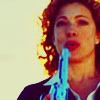
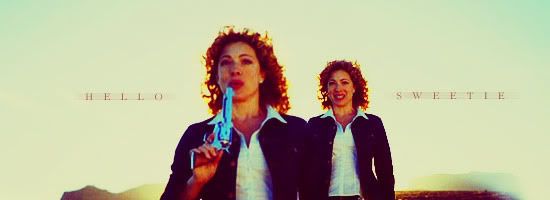
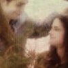
This is the 1st time I've made anything with this effect (the greenish-purple-blue over the pic) what do y'all think of it? Do I need to tone it down or anything?
I like the effect and the glowin text matches nicely but the green glow might look a little odd on Arwen's face. It might be me though. Other then that, it looks quite lovely! The text is actually readable which is always nice...
Joined: 30 October 2005 Posts: 5188 Location: 'Dance like flame cuase theres no gravity, and now I am just a candle trying to stay lit... Country: Gender: Female
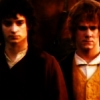
I think its nice- but if you dont mind I will make a few suggestions...
On your banner the word "fading" on the F on it, if you notice its cut off a lil. I am not sure what program you use but if you redo it and type a few spaces before the text that may work. The texture cinda fades the picture out a lil.
Hope im not being rude! Its a great banner+avvie though ^_^
Users browsing this forum: No registered users and 4 guests
You cannot post new topics in this forum You cannot reply to topics in this forum You cannot edit your posts in this forum You cannot delete your posts in this forum You cannot post attachments in this forum


 The text is actually readable which is always nice...

")

")

")


")


