Please scroll down for the results of Round 11 and awards.
_______________________________________________________
Basic info -- recopied for reference.
+++++++++++++++++++
[x] Good day to all. This is a contest that which is very much different from all the other general contests. Only this contest, you have to be more creative with a limited amount of choices that are offered to you.
[x] The name of the game: As it is, it is called the Screencapture Contest, and as you may have noticed there are rounds to this contest meaning I will continue with contests in the same routine [with variables...well..varying.

]
[x] Basically I will provide one or more screencaptures of various things. Whether it be Lord of the Rings, Harry Potter, a picture of a book, or a landscape capture. You will then use those screencaptures to make your graphic [avatar, banner, etc.].
Rules:
- You must
only use the screencaptures given to you.
- You must use them to make the required graphic (ie. Round: Avatar)
- Your entry must be a newly made entry. [Preferably with some kind of signature.]
- There will be no limit to the entries (meaning any number of people may enter), as long as it is entered by the date. Any entry given latter the date will be shown and recognized but will not be included in the judging (unless given a very good reason as to why you entered late).
[x] Judging: Judging the graphics will be up to other moderators and/or random members. However there will be no poll. I will survey individual people. There will be a 1st place, 2nd place, 3rd place, and honorable mention. I've added another place called
Host's Choice, because I always want a certain one to have an award.
[x] Awards: Will not be guranteed the best in the world. I will try and see if anyone will be willing to make the awards at the end of contests or I will do to the best of my ability to make them, though take my word for it, my skills suck. I do, however, have the almighty useful Photoshop 7.0. I'll cook something up if I must.
++++++++++++++++++++++++++
<center>
Screencapture Contest - Round 12</center>
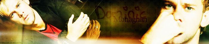
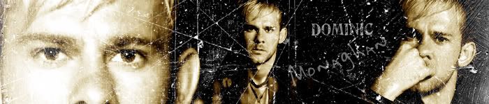
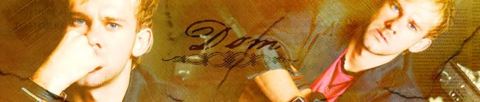
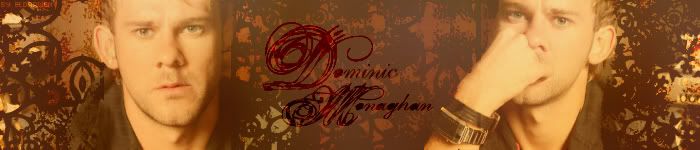
<center>
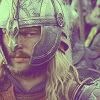
Theme: Dominic Monaghan</center>
<center>
Graphic: Banner</center>
<i>Images:</i>
>> Pictures removed by ending of contest.
<center><i>Do not post to ask for a spot to be saved. Just get the entry in by due date.</i></center>
Notes:
---The rules above apply.
---You do not have to use all the pictures.
---The initial banner must be 700 x 150 pixels.
---Anyone can enter --- no limit of participants. One entry per participant.
---Post the
LINK to your entry in your post. Try not to use the image tool.
---Entry is due by Friday, September 8th, 2006 at 11:30 pm EST.
---Good luck and HAVE FUN!

++++++++++++++++++
Members Entered:
[x] Enedlhach -
Entry
[x] Limwen Villya -
Entry
[x] Pandora -
Entry
[x] evenstar of mirkwood -
Entry
[x] Riniel Anariel -
Entry
[x] thedirector -
Entry
[x] timtimtimtim -
Entry
[x] Morwen Anduril -
Entry
[x] Eldarwen -
Entry
[x] Johnny's Fan -
Entry
[x] Maetharanel -
Entry
[x] ~Shieldmaiden~ -
Entry
Judges Signed Up:
[x] Merry & Sam
[x] Larael
[x] Luthien Star-Lover
++++++++++++++++++
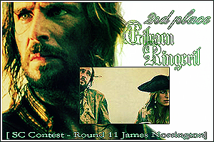
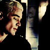
Awards/Results of Round 11 [James Norrington]

Our 1st Place Winner:
Johnny's Fan _________ Our 2nd Place Winner:
Gilraen Ringeril


Our 3rd Place Winner:
Nordic __________ Our Host's Choice Award:
pirateoftherings

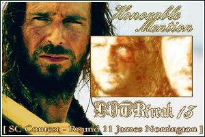
Our two TIED Honorable Mentions are:
Pandora &
LOTRfreak13
P.S. Probably the most popular SC contest round in a very long while. Great round guys! There were some tough decisions to be made!
P.P.S.: I made the awards this round. Photobucket-hosted. Please be patient if loading slowly or not appearing, try again later.
Those who voted/judged:
1. Merry & Sam
2. Luthien Star-Lover
3. Beri
4. Thenidiel
5. Alatariel
6. ViviElessar
<b>Comments:</b>
<u>Everyone:</u>
“This was really hard! Everyone's entries were simply splendid!” –Merry & Sam
“Wow! All of the entries are amazing!” -ViviElessar
<u>Nordic:</u>
<i>“I love the unique color, and everything fits in so well!” –Luthien Star-Lover
“I love the arrangement of the banner, and the text is nice & subtle. The colouring is very cool...can't think of anything you could improve.” –Beri
“Again, this person used different colors. Love the way the images are blended. Good job!” -ViviElessar</i>
<u>Elenanna Lothendhel:</u>
“The texture and pictures fit in very nicely, although the middle picture looks a little out of place. Other than that, it is very well done.” –Luthien Star-Lover
“Nice, I really like the font you used. I think it would look better if the far right picture were moved up a bit. And maybe a smooth overlaying texture instead of the grainy brush(?).” -Beri
<u>Riniel Anariel:</u>
<i>“The colors and pictures blend in perfectly, and the slightly bold text stands out. I like it!” –Luthien Star-Lover
“Love the colour and texture. Awesome font too, though the text is placed a bit weird...it would be better if it didn't almost cut across his face.” -Beri</i>
<u>Eowyn Arelen:</u>
“The greyish hue looks good on this one, although the text is a little hard to read. It is very nice though.” –Luthien Star-Lover
“I like it, except for the faded picture, sort-of in the middle. I think something stronger, like a nice brush or something would work instead (as to not leave it blank).” -Beri
<u>~RinielAranel~:</u>
<i>“The fancy text is a little overpowering, but other than that I really like it. Everthing seems to fit in nicely.” –Luthien Star-Lover
“I like the banner itself, nice pictures and texture but the text isn't working for me. It's too busy and you can't easily read it.” –Beri
“I like this one because it looks different from the rest. The colors and brushes used are great!” -ViviElessar</i>
<u>CedricsGirl:</u>
“The brown and white theme looks great, but somtimes James is a little hard to see.” –Luthien Star-Lover
“Haha, rugged suits him indeed. The banner's a bit too faded & light for my taste.” -Beri
<u>Pandora:</u>
<i>“I loved the texturing and brushed you used for it. The smaller cropped pictures were an awesome touch. They really add to it. I also like the way the writing is going up along the side of it and curving into the top. That looks really cool. It's a very creative and well thought out banner. Awesome job!” –Merry & Sam
“Lovely colors on yours, I love the text too. The middle picture thing looks a little harsh though. Overall I really like it
” –Luthien Star-Lover
“I like it very very much! Love the colour, text, texture, and the little snippets of his face from different pics is a really nice touch.” -Beri</i>
<u>Johnny's Fan:</u>
“Your banner has an awesome feel to it. The quote, is magnificent, and I loved the way you centered the banner around it and it sort of set the mood for the whole thing. I liked that you didn't overcrowd it with pics, and really played up the two that you used. Keep up the good work!” –Merry & Sam
“This one I really like, the blue sort of "pretty" theme is really unexspected and is just overall very well done.” –Luthien Star-Lover
“First place banner in my opinion. Great colour, original text w/ nice font, and a very effective starry-feel. No criticism, I love this banner.” –Beri
“I loved the fact that is blue. It really captured my eyes. The brushes and the text are awesome:).” -ViviElessar
<u>SuperGirl:</u>
<i>“Nice and "clean" feeling, the white and blue look refreshing.” –Luthien Star-Lover
“I really like the concept of the banner, though I think I would like it better if the effects used on the picture of Norrington & Elizabeth were a bit less...harsh (can't think of a good word). If it was softer or something.” -Beri</i>
<u>Gilraen Ringeril:</u>
“I liked the sort of smoothness your banner had where a lot of the other ones were a bit edgier. It was cool how you didn't end up using any fancy paint brushed or wild textures, but you still made the pictures look really good and it didn't come out too plain. It's a job well done!” –Merry & Sam
“I like how this one all fits in together, the colors and text suit it perfectly.” –Luthien Star-Lover
“I like the colouring, texture, and font. Overall a good banner, but it's missing a focal point or a finishing touch or something.” –Beri
“Love the coloring and the sharpness of the banner. Looks amazing!!” -ViviElessar
<u>pirateoftherings:</u>
<i>“I loved the quote. That's awesome. The texturing and brushed you used were perfect. They weren't too rough and gritty and they weren't too simple. They also sort of went with the theme I think of Norrington moreso than some others. It's a great banner!” –Merry & Sam
“I like how yours is "old" looking, it really suits it. Very well done
” –Luthien Star-Lover
“I like it, but it seems over-texturized and missing a focal point. The text would be nice if it were a bit stronger. I seem kind of critical, I really do like it
” -Beri</i>
<u>LOTRfreak13:</u>
“The bright contrast and glow looks very good on this one!” –Luthien Star-Lover
“Lovely colour, and texture. One of my favorite banners of the bunch.” -Beri
<u>Arewen Telemnar:</u>
<i>“James is a little hard to see, but I like how the text stands out on this one.” –Luthien Star-Lover
“The picture of Norrington is a bit too subtle, it would be nice with more contrast. I do like the text, and the difference between the two fonts is neat.” -Beri</i>
+++++++++++++++
Thank you all for participating!
-[kitoky]


")


")
")

 I honestly didn't think I would ever come 1st in one of these contests as the other entries are always so great. I've come a long way from the "so-embarassing-I'd-rather-not-mention-them-in-detail" banners I used to enter
  Your welcome. I really like the fact you added parts of the orignal entry to the award.

 <br><br><a href="http://immortalkiss.sarrand.net/"><img src="http://immortalkiss.sarrand.net/ik_lb6.jpg" border="0"></a>