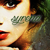
1st: Limwen - Villya
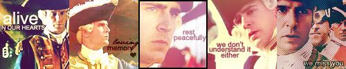
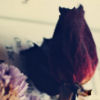
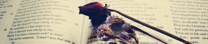
2nd: Morwen Anduril
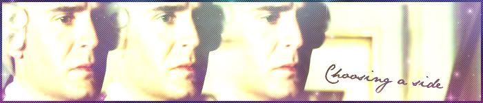
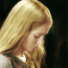
3rd: Riniel Anariel
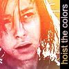
Honorable Mention: Johnny's Fan
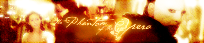
<b>Limwen - Villya:</b> Beautiful, beautiful, beautiful. It fits with the Phantom of the Opera perfectly. The blending and particularly the font is beautiful. Texture, wonderful, border, complementary. I really don't see anything wrong.
<b>Johnny's Fan:</b> This is probably the first contest that I didn't vote for you to place in the main three places. The reason being is that I felt you could've added more, you didn't quite reach your full potentional for the banner because I've seen you do a lot different, a lot of great graphics and this one just didn't seem to have it. If you were focusing on the music instead of the people/actors then I'll give you props for that, though again, if you were then the lyrics could stand out more... The overall banner seemed kind of static.
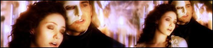
<b>Merry & Sam:</b> I would've voted for you if there was another place to fill because this one is unique and it's different from the rest since it revolves more on Christine instead of Phanny. I really like the color scheme and the blending is excellent. The font is also fitting, but I like that kind of font. The pattern across is unconventional but it does add to the banner. Great job!
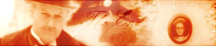
<b>Morwen Anduril:</b> I voted for you just because you put Raoul in. I'm sorry, I can be biased if you guys can be biased. I. Love. Raoul. It's simple, it's sweet, and very sad actually, but it's beautifully made. It had that vintage feel, and it's just sad. It emitted an emotion that amazing pieces always give off. I, when I see it, feel sad.
<b>Luthien Star-Lover:</b> Normally, I love your pieces. And when I first looked it did look very nice, very glowy and shiny but when I kept looking at it, it seemed to lack. And you know I LOVE simplicity, you can't go wrong with simplicity but it seemed like it needed a prominent texture or a color scheme or some text or SOMETHING.
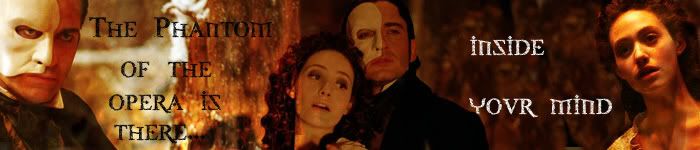
<b>Riniel Anariel:</b> I like the grainy-ish pattern on this one. The blending is nice, the banner is well balanced, but it seems the black specks and the yellow-ish spots seem to draw too much attention from the overall piece because they stand out so much. I like the three "Phantom of the Opera"s with different levels of opacity though.

<b>Altariel Frodo:</b> Nice, simple --- although a bit blurry for my taste. I think the blurriness, fading image of the Rose and the sharp bright "Learn to be Lonely" text seems to have too much of a contrast. It has a nice theme, and I like the scratchy text.
<b>Fencing Maiden:</b> Awesome, awesome blending. It's the first thing I noticed when I saw this one. Though, like Luthien Star Lover's, it needed something more, maybe a color scheme or texture.
<b>Amara:</b> This banner was actually kind of creepy. It had a nice theme, and I liked it... but it needed originality. In the past, I've seen a lot of PotO with the same kind of set up but I'm not really going to fault it against you. Darn those blasted idea-stealers! >:0 The font is neat, though very kind of gothic or Celtic---one of those. It'd be good if you explored trying to blend the text into the image or maybe learn to stroke/make a border for it. Otherwise, it's very nice.
-[kitoky]


")


")


")